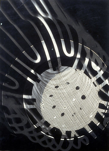
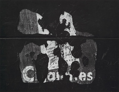
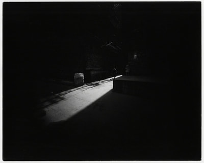
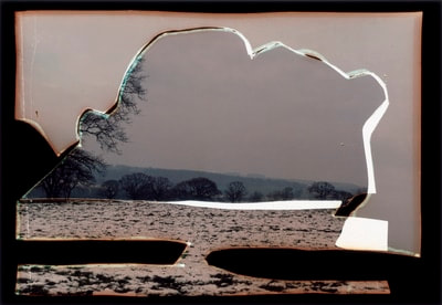
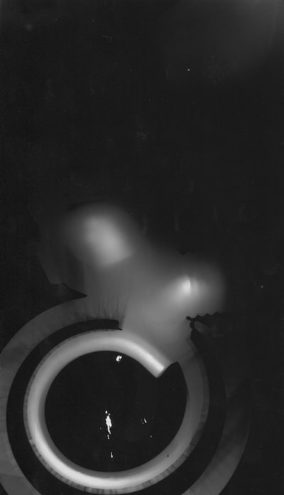
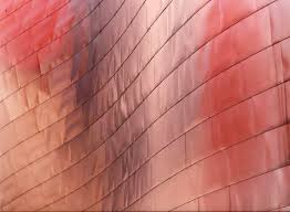
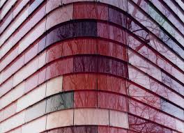
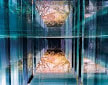
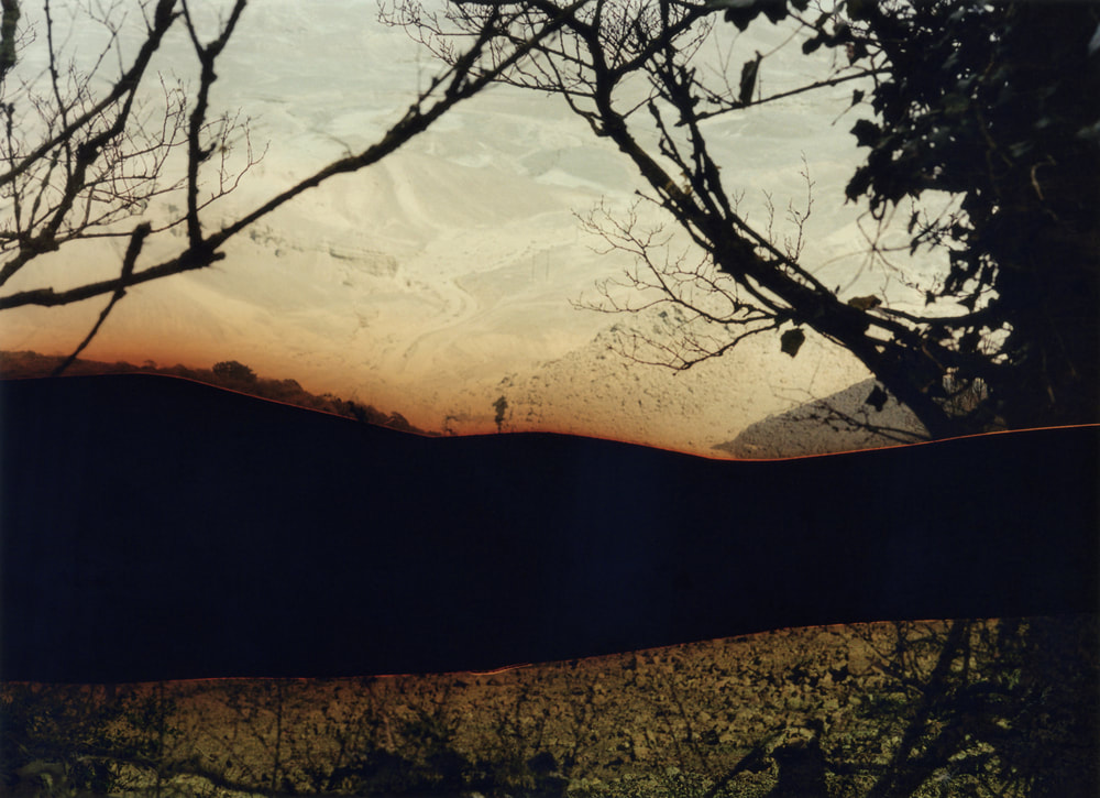
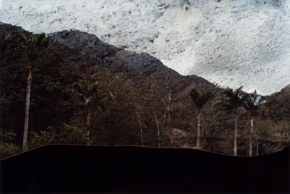
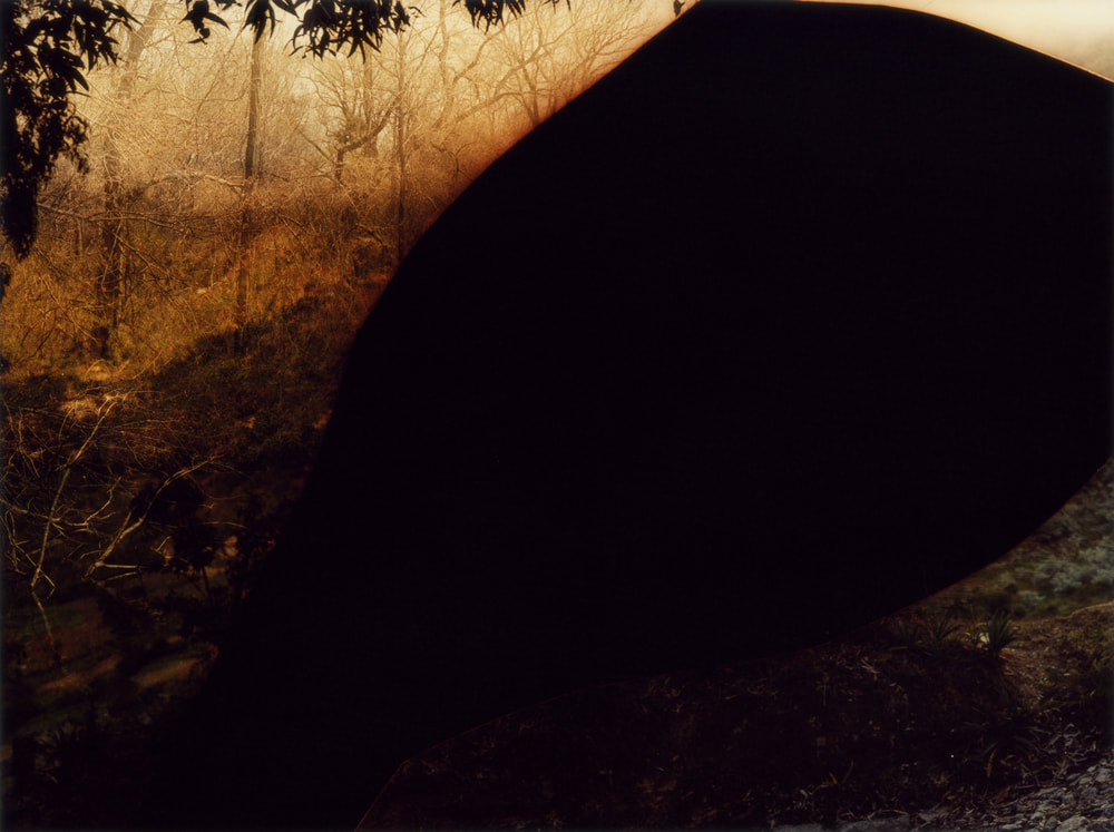
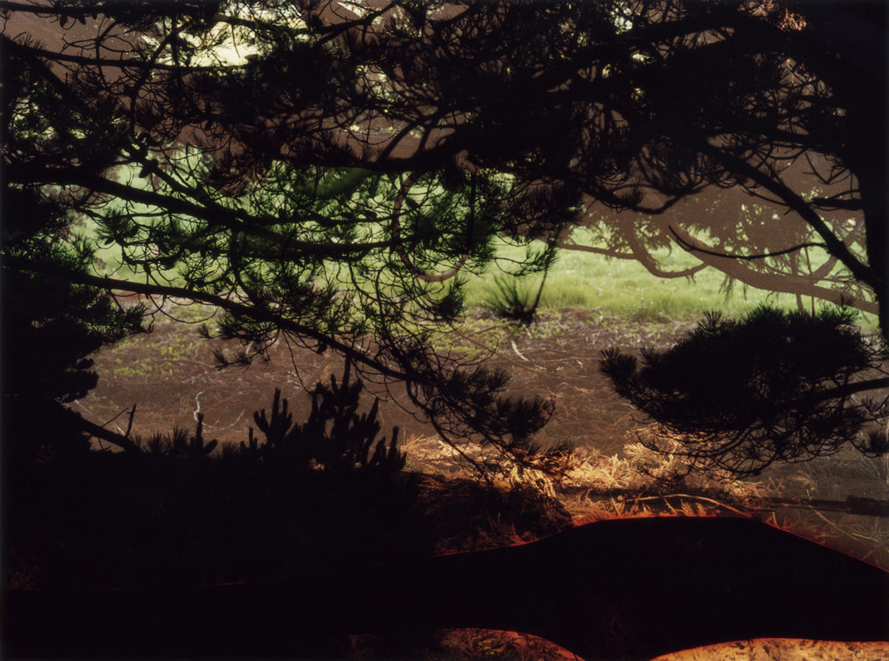
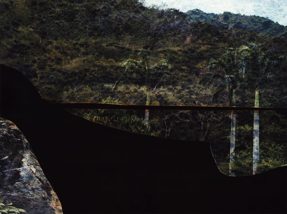
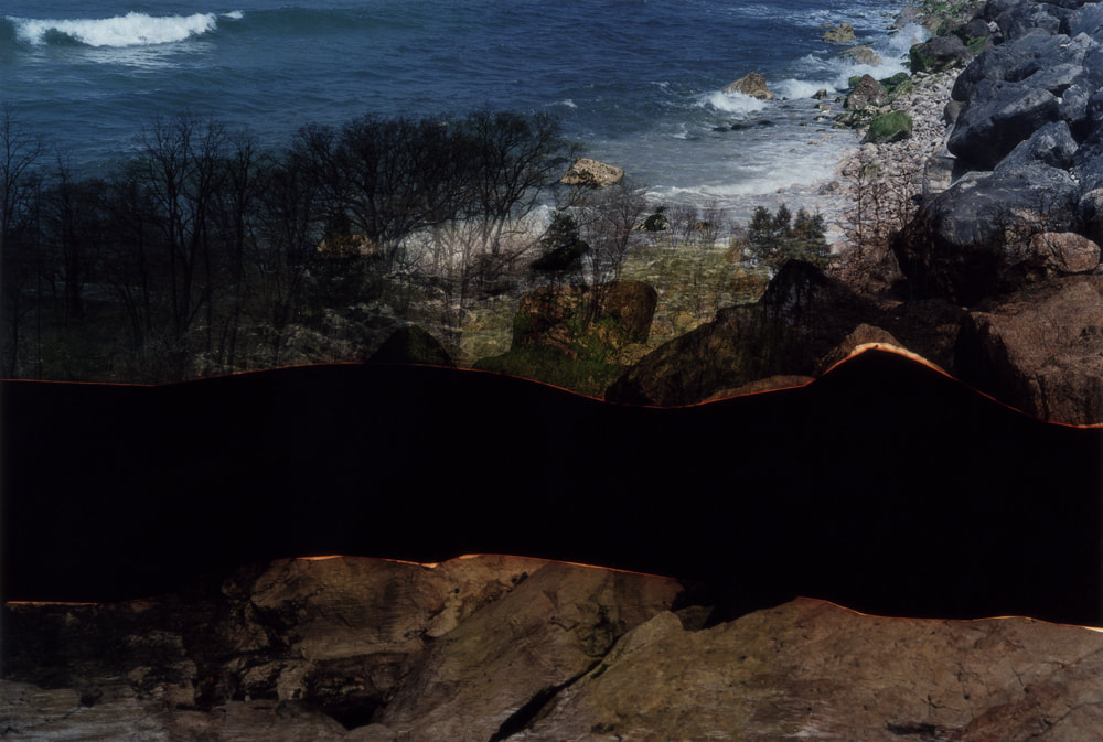
Today in photography we had a visit from a well know photographer, her name is Dafna Talmor. She showed some of the amazing pieces of art and photographs that she has created through out recent and more distant projects. All of her images had an amazing effect, they all showed a great range of dark and light tones and had lots of shadows and blacked out backgrounds and areas which have been changed to help to develop and refine her project.
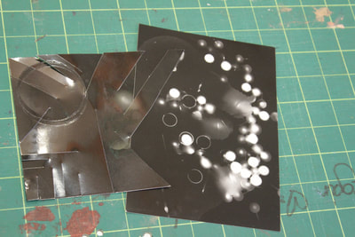
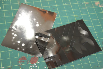
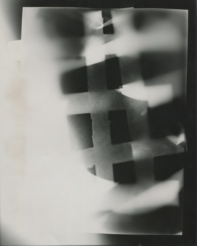
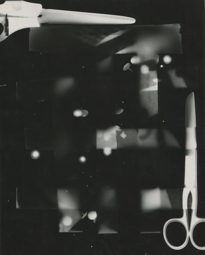
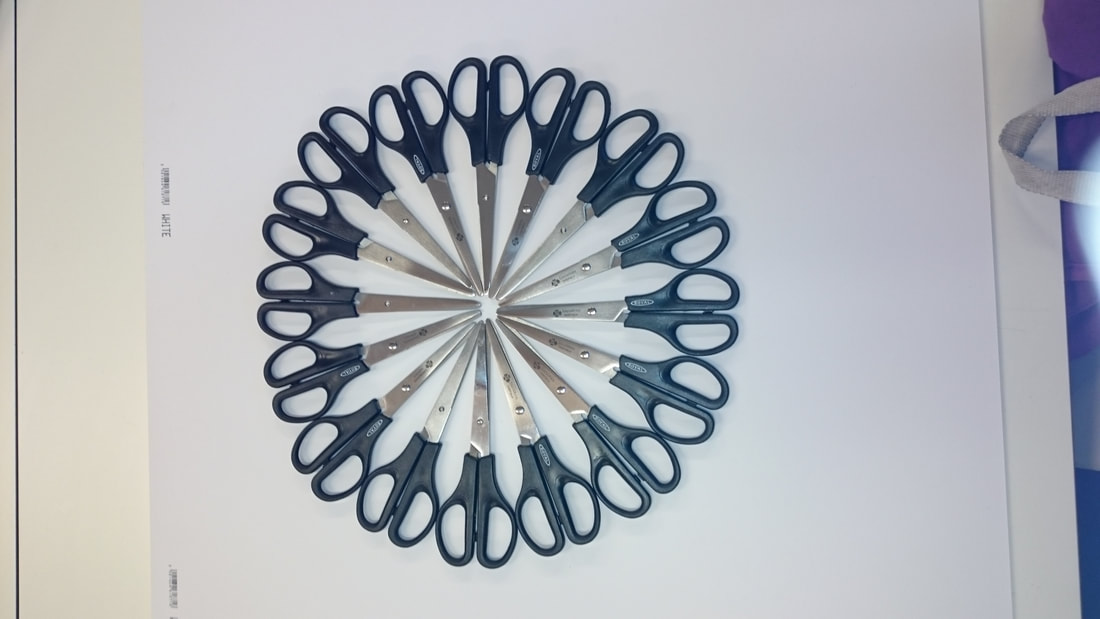
We were inspired by her work and were given task in which we had to try to create our own images out of either random or carefully selected already made negatives. We were also given other materials, for example a hole punch, coloured tape, coloured paper, scissors and more.we could use as many or as little as we wanted. Overall i created three successful negatives each using at least two negatives combined however sticking to the Tallis habits of Persistent, Inquisitive, Disciplined and Imaginative i created two more images although were not as effective and successful as the other three.
Here are a few of the many successful pieces of art Dafna has created.
Abstraction
|
I would argue that most works of art are abstractions and that everything in life is art because they are representations of life rather than real life. Most people would agree that abstraction is a kind representation of naturalism however on the other hand it could be completely unnatural.
I think that this project is about how the camera can draw attention to the formal elements of art in order to create images in which the subject isn't the most interesting element. |
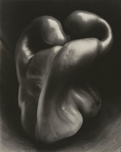
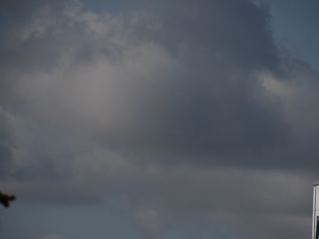
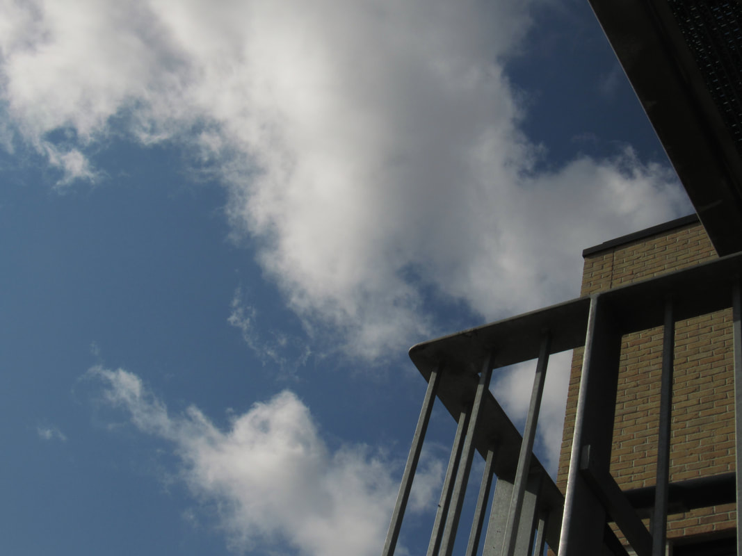
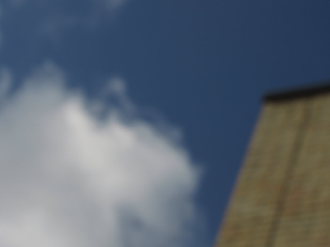
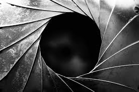
The Formal Elements photographers are usually aware of the processes and stages of which they took to capture there photograph they usually plan how there are going to do things like were the light is going to come into the photograph, the angle they want to take it from, how they can add the effect of shadows and how they can use shape, they are just some examples of the way you can use key elements and processes that photographers go throughout that are beyond the simple fact of the subject. This is what separates good pictures and bad pictures of the same thing. The following list describes some of the abstract elements in any photograph. Below the list is an example of how you can analyse a photograph looking for these things specifically and how this helps to give the image meaning:
The Formal ElementsPhotographers are usually aware of the ways in which they can create interest in their images beyond the simple fact of the subject. This is what separates good pictures and bad pictures of the same thing. The following list describes some of the abstract elements in any photograph. Below the list is an example of how you can analyse a photograph looking for these things specifically and how this helps to give the image meaning:
Focus:Which areas appear clearest or sharpest in the photograph? Which do not? light":Which areas of the photograph are brightest? Are there any shadows? Does the photograph allow you to guess the time of day? Is the light natural or artificial? Harsh or soft? Reflected or direct? line:Are there objects in the photograph that act as lines? Are they straight, curvy, thin, thick? Do the lines create direction in the photograph? Do they outline? Do the lines show movement or energy? repetition: Are there any objects, shapes or lines which repeat and create a pattern? shape:Do you see geometric (straight edged) or organic (curvy) shapes? Which are they? space:Is there depth to the photograph or does it seem shallow? What creates this appearance? Are there important negative (empty) spaces in addition to positive (solid) spaces? Is there depth created by spatial illusions i.e. perspective? texture:If you could touch the surface of the photograph how would it feel? How do the objects in the picture look like they would feel? value/tone:Is there a range of tones from dark to light? Where is the darkest value? Where is the lightest? |
|
|
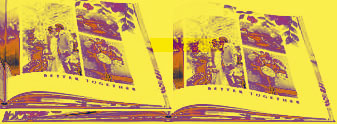
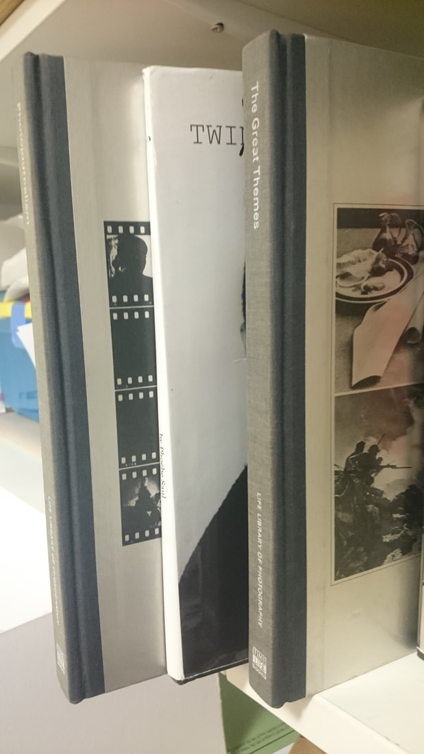
How to make a photo book and the proccesses
A photo-book or photobook is a book in which photographs make a significant contribution to the overall content. Photography can be expressed in many ways.They are usually used when making scrap books or photo albums but they are a more colourful and creative way to create a loving memory or a lovely book to display an amazing sense of photography.
|
|

When creating a photobook you can use an app using, special paper and entering your photos online and others can be simply made with card,paper and a printer and you can bind your photography in to a book that you can share will all of your friends and family.
A photobook can bee used to show your progress and to help you sort and show off your amazing photography which can be made of anything at any time. |

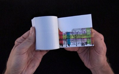
These photobooks have been created to help to show this persona art and he been used to store the photography of this family, friends and pets.these books also show information like when these images were taken who is in them and who took the photograph.how has abstraction changed and been used in photography?Photography advanced the objectives of representation. It provided extraordinary detail rendered with exceptional precision; never before had images looked so life-like. Photography changed our vision of the world by providing more access to more images drawn from more places and times in the world than ever before. Photography enabled images to be copied and mass-distributed.photography when looking at abstraction i think means influencing and representing a visual image that does not have an immediate association with the object world and that has been created through the use of photographic equipment, processes or materials.what do you have to think about when making a good abstract photograph?.....
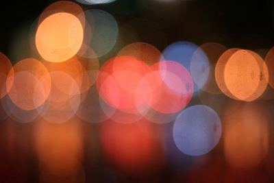
- Smoke within the photograph or image.
- light painting
- bokeh the background.
- Bluring out parts of the image.
- the angle of light.
- Reflections possibly in a mirror.
- Shadows of the object or in the background.
- Architecture within the thought process of planning the layout.
- Interesting patterns within the photograph.
- settings (macro).

These images have been chosen because they are the most abstract and
have been improved and refined and i think that they have been well
thought out and has been planed.
I am going to use these images below to create a photo book unique to
me, Whilst following the theme of abstraction as best as i can and
trying to create a successful and finished photo_book by the end of the
dead line. In my opinion it would be successful if i had 32 or more
images or more and if they have been uniquely edited for example change
the contrast in the colour or just change the colour all together and or
cut so you can see different images behind to try and create a new
image or to be ably to reveal part of the next image. To be more
creative in this book i want to have all of my images that i took at
home.
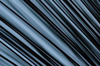
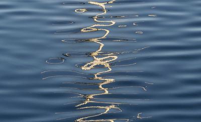
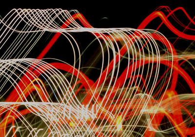
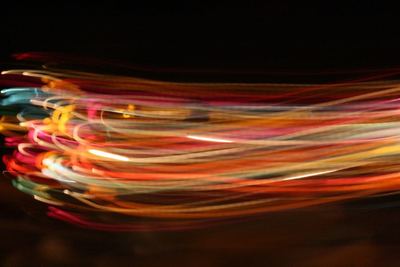
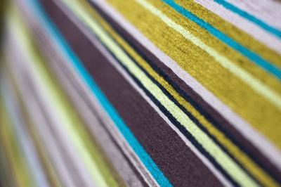
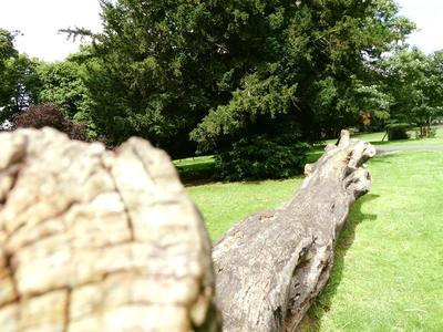
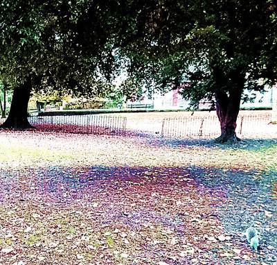
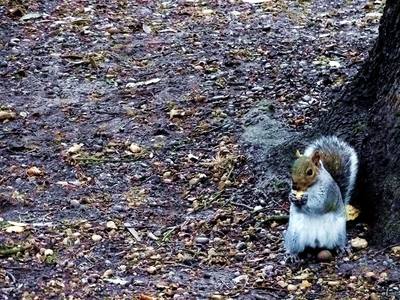
Abstract Photography
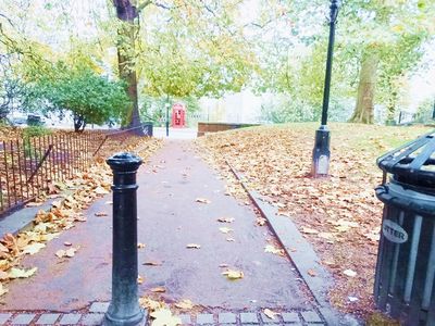
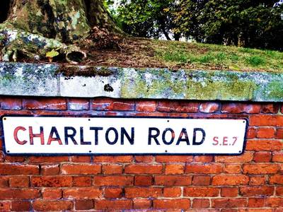
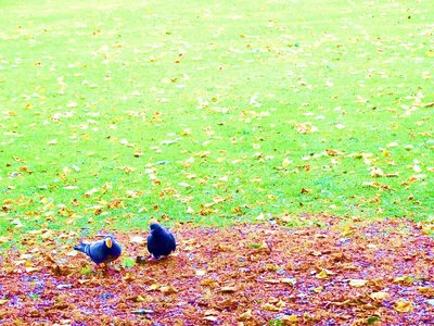
some of these photgraphs have been taken on a day out but alot of these photographs were taken in and around my local park and i have been playing with and refining my work and trying to add to and eddit each time i photograph to make my work look better and more abstract.I have placed my favrouite image first and my most disliked image last but it is not in a specific order form there.The bottom row are my worst photographs and i think that they are the images that could be the most improved and the first row are my favourite image and can't be improved much more which means that i will have more time to play around with the images.
some of these photgraphs have been taken on a day out but alot of these photographs were taken in and around my local park and i have been playing with and refining my work and trying to add to and eddit each time i photograph to make my work look better and more abstract.I have placed my favrouite image first and my most disliked image last but it is not in a specific order form there.The bottom row are my worst photographs and i think that they are the images that could be the most improved and the first row are my favourite image and can't be improved much more which means that i will have more time to play around with the images.
what is a Formal Elements in photography?.
a formal element is here are some photographs to sow some objects caught in their formal element.
Successful photographs rely on order, and the main elements that emphasises the order in the composition for example line, shape, form, texture, pattern, and color. Every photograph, intentionally or not, contains one or more formal elements, which are known as the elements of design
Successful photographs rely on order, and the main elements that emphasises the order in the composition for example line, shape, form, texture, pattern, and color. Every photograph, intentionally or not, contains one or more formal elements, which are known as the elements of design

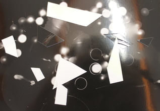
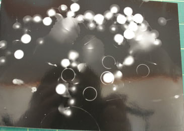
Photograms
what are Photograms?
A photogram is a photography image made without
a camara by placing objects directly onto the surface of a
light-sensitive material such as photographic paper and then exposing it
to light. The usual result is a negative shadow image that shows
variations in tone which usually depends on the transparency or
thickness of the objects used. Areas of the paper that have received no
light appear white; those exposed through transparent or
semi-transparent objects appear grey.
|
|

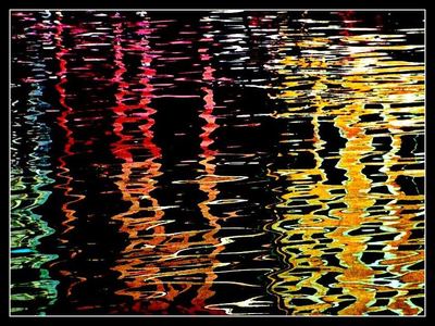
Exposure and colour change
I have taken this single image and changed and
improved it in different ways using colour and contrast to make them
look different and unique to change them to be different tone of colour
and to fit my style of work which is also following the theme of
abstraction whilst editing to make more than one image out of the
original and to show that in m work, in which case publishing on my own
web_page which we will be carrying on through out a lot of this year in
photography.

My Favourite Abstract Photographer.
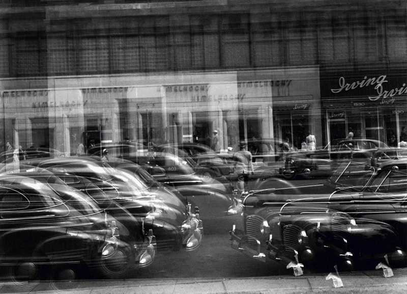
Harry Callahan and Jackie Ranken
Harry Callahan was an American photographer who experimented in many fields from abstractions to people who wasn't fully dressed and even botanical studies. He taught photography at the Chicago Institute of Design in 1946 and, in 1949, took over as head of the college’s Department of Photography.
In abstract terms, he created simple landscapes from regular points of view, all while including human elements. He also did what I personally call “micro landscape photography” with his weed studies. In these, he depicted small weed bushes growing in the snow as isolated forests, which is something similar to the real forests captured by Michael Kenna
here are a few photographs that the took in his career.
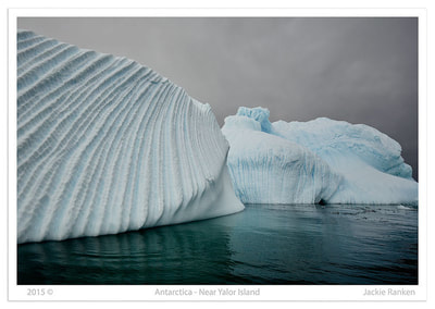
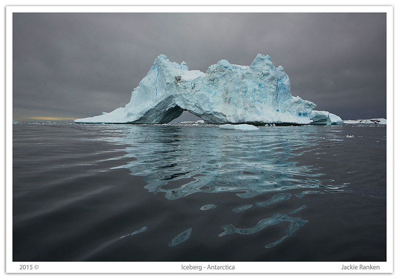
Jackie Rankin learned her craft by working as a darkroom technician, and was a freelance and sports photographer, a wedding photographer, a commercial photographer and a photojournalist she has many other interests although she dedicated most of her time to the projects in photography.
Focusing on two of my favourite projects, the first is called "Aerial Abstracts." In this project, Rankin has taken aerial landscapes of Australia with a single piece of gear which was seen in a medium format camera generously loaded with plenty of 120 black and white film. The other project is a beautiful narrative crafted with conceptual and abstract works done only in Antarctica. she used to pick them out herself.
Truly a great and remarkable piece of eye candy that hints at the abstract and lands on surrealism is Rankin’s "Other Realities" project, which has well known elements of landscape photography.
here are some examples of her art


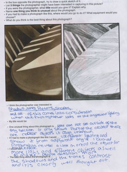
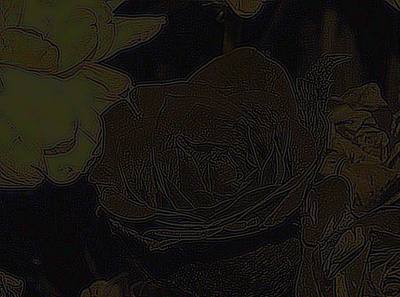
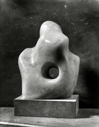
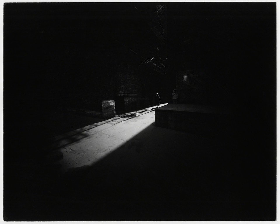
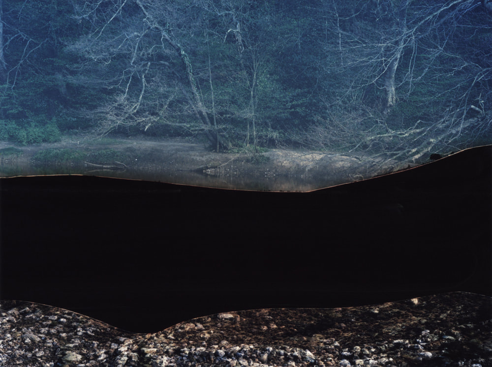
Dafna Talmor
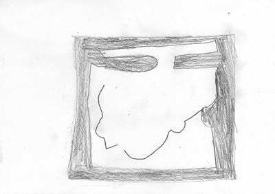
In this task some people were given a black piece of
paper and a white pencil or a white piece of paper and a normal pencil
as you can see I have been give a white piece of paper therefore a
normal pencil and i was asked to draw and shade the darker areas of this
amazing photograph by Dafna Talmor
In Dafna's gallery there are lots of photographs
that are clearly unique to her, which is one of the resons why I like
this gallery and I would definatly recomend it to a friend.I have learnt
lots about how we can use light in lots of different ways which is
useful because the technical definition of photography is drawing with
light.Contrast is important because it helps to show colour (if you have
any in the photograph you have taken) and the tone or even where the
light is coming from, which can be key when talking about the
photographer and hes/her techniques.Vistiting this exibition has allowed
me to think about and veiw the different techneques of playing with
light.
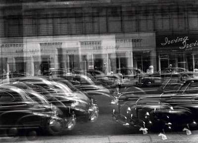
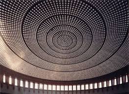
Tate modern-The Radical Eye / Wolf Gang and Tillmans

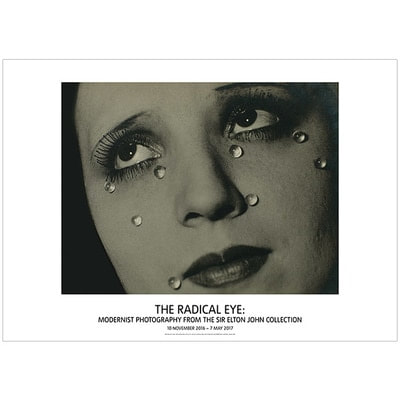

As a class we visited the tate modern galler in which we veiwed two exsibits one tittled The Radical Eye and the other named Wolfgang Tilmans.
This experiance has inspired me to be unique and to stick with difficulty and mabe in the future we will be able to create our own profesional gallerys inspired by Dafna Talmor or Tate modern. We all had different opinions and there were so many questions to be asked, for example why did you use that shade of colour?,why has that image got more contrast compared to the other?, how many times did you have to take the picture to get it perfect or just the way you wanted it?.I have learnt about lots of creative possibilitys whilst on this trip for exsample, some of the photographs i have veiwed can be interperated in different ways like the image that spells tate modern above looks like it could be lost of lights put together, it could be pointillism or designed free hand.I have had almost all of my questions answered like, how big it the gallery?, how many photographers have made the decision to display their art in this gallery?, How long have these photographs been here? or even how many famous photographers have visited the exsibit
This experiance has inspired me to be unique and to stick with difficulty and mabe in the future we will be able to create our own profesional gallerys inspired by Dafna Talmor or Tate modern. We all had different opinions and there were so many questions to be asked, for example why did you use that shade of colour?,why has that image got more contrast compared to the other?, how many times did you have to take the picture to get it perfect or just the way you wanted it?.I have learnt about lots of creative possibilitys whilst on this trip for exsample, some of the photographs i have veiwed can be interperated in different ways like the image that spells tate modern above looks like it could be lost of lights put together, it could be pointillism or designed free hand.I have had almost all of my questions answered like, how big it the gallery?, how many photographers have made the decision to display their art in this gallery?, How long have these photographs been here? or even how many famous photographers have visited the exsibit
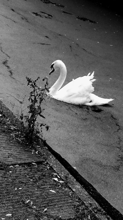
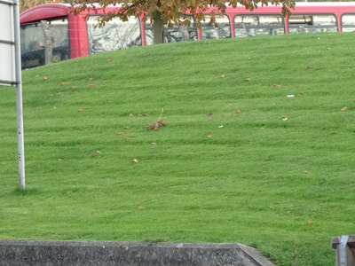
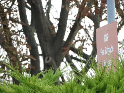
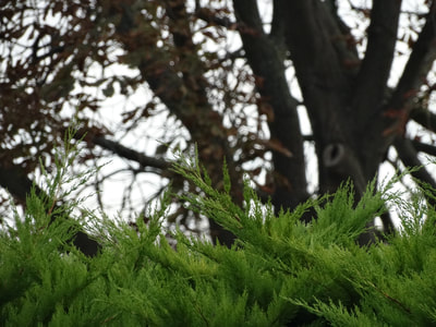
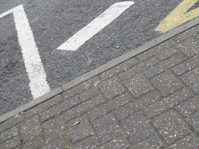
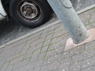
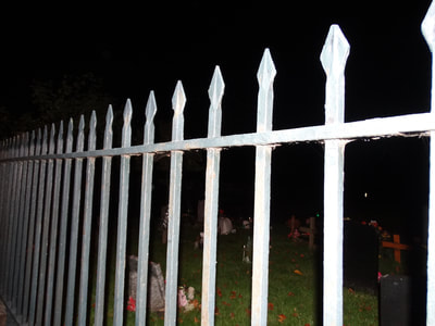
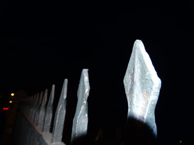
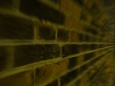
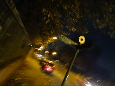
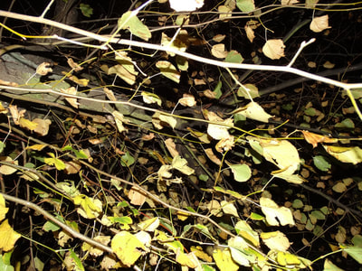
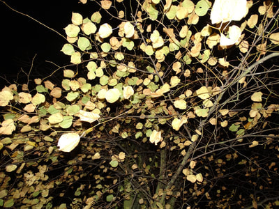
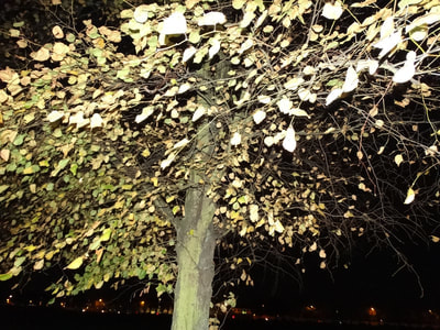
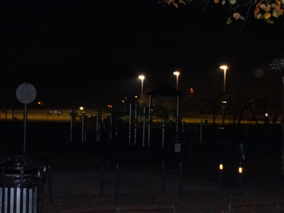
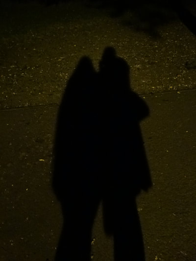
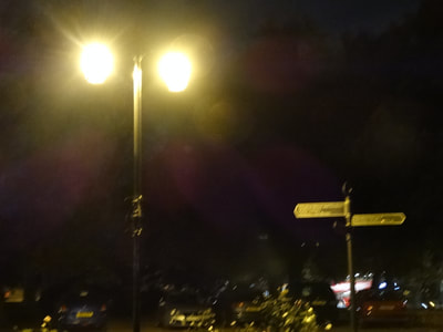
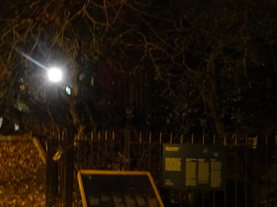
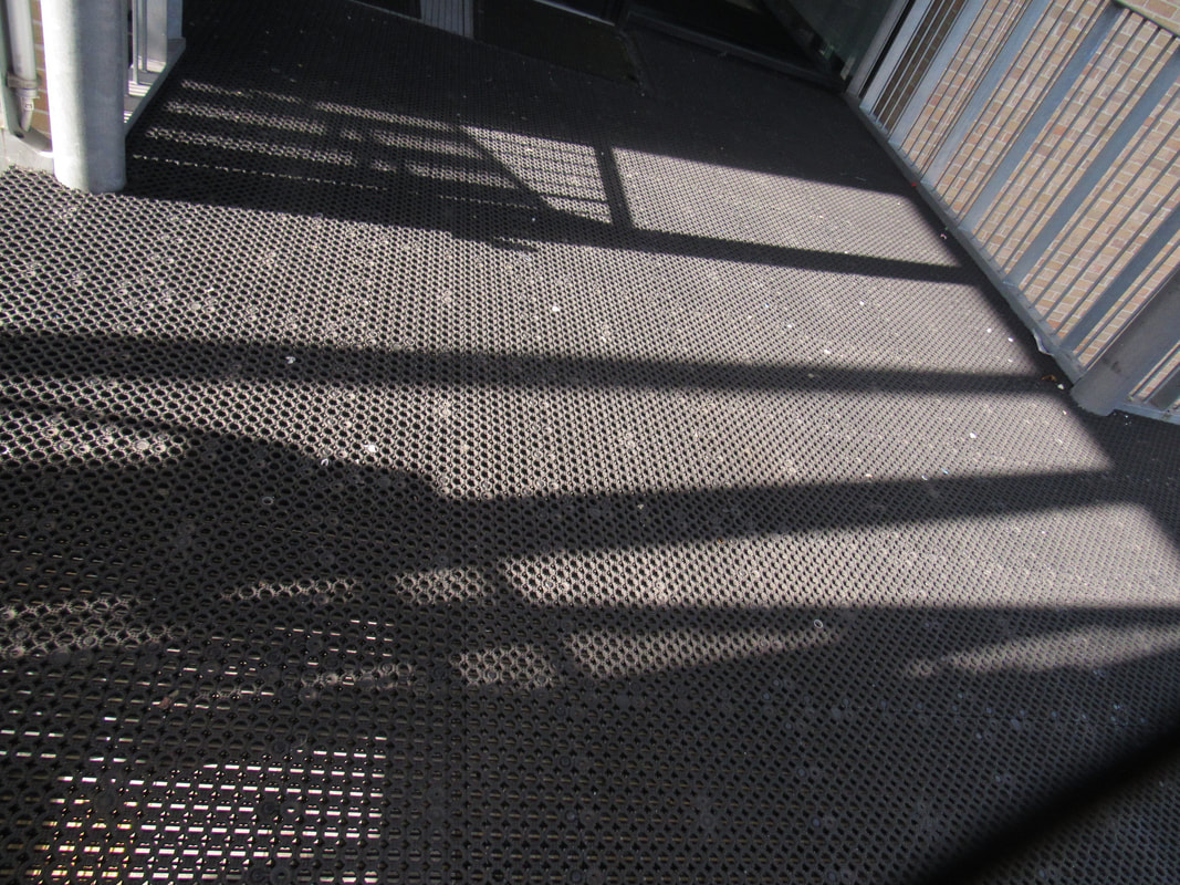
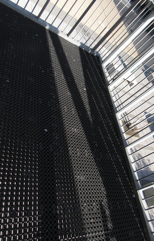
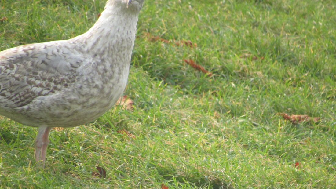
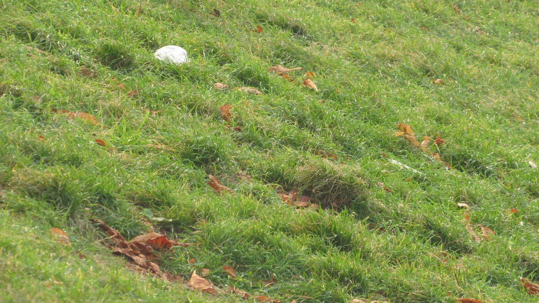
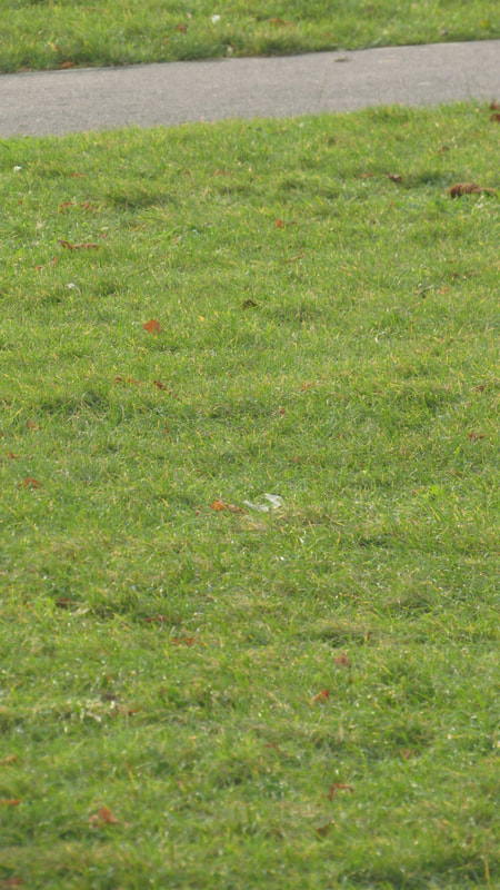
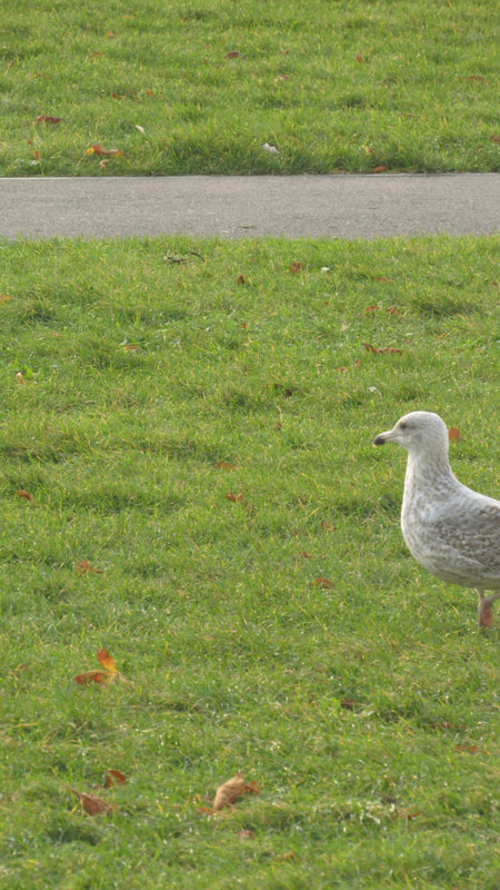
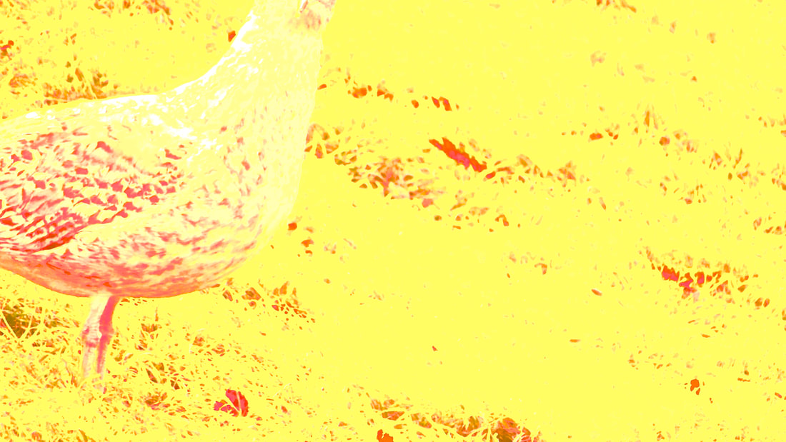
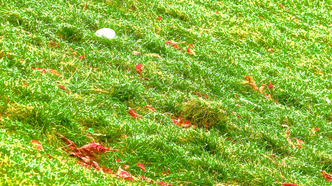
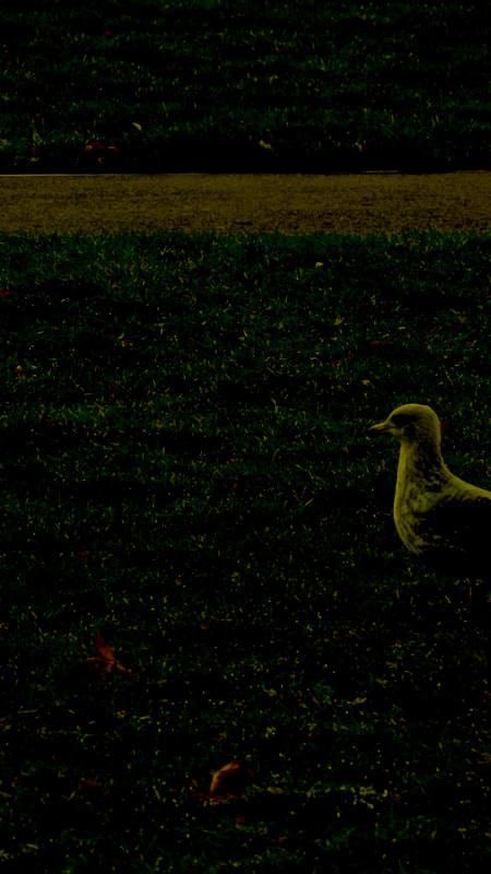
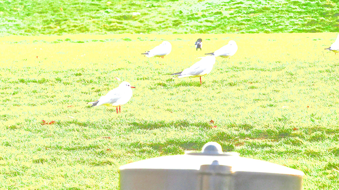
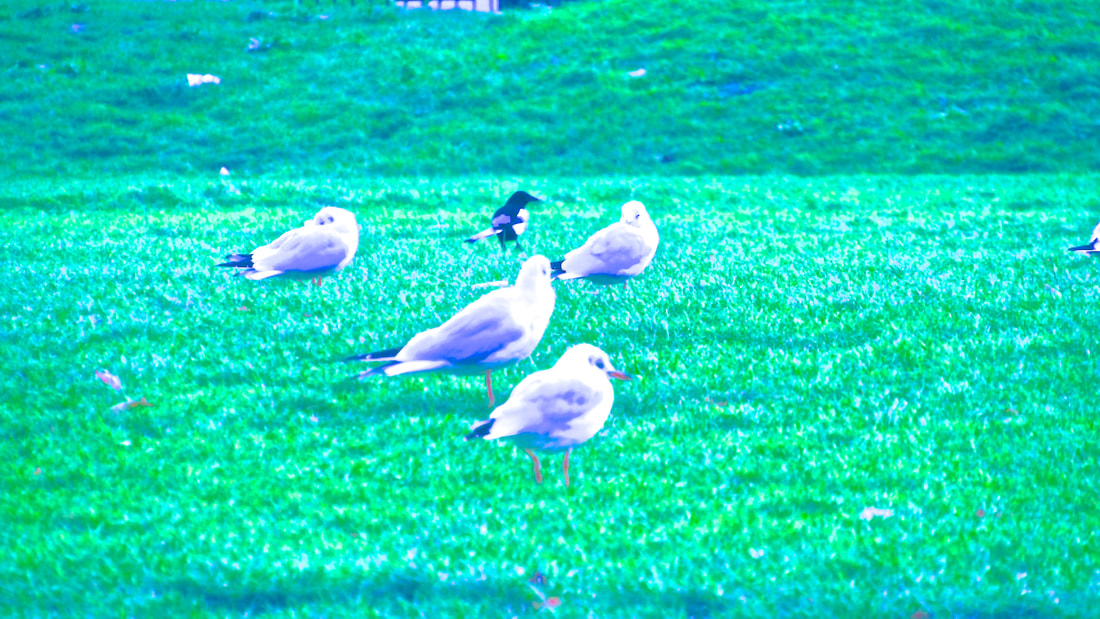
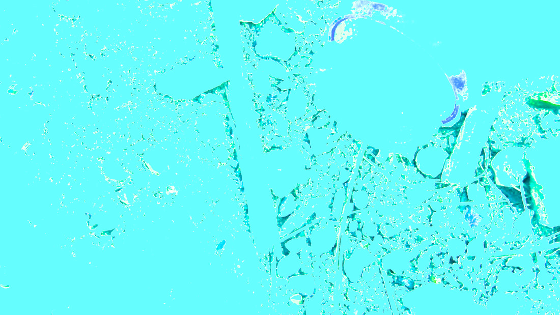
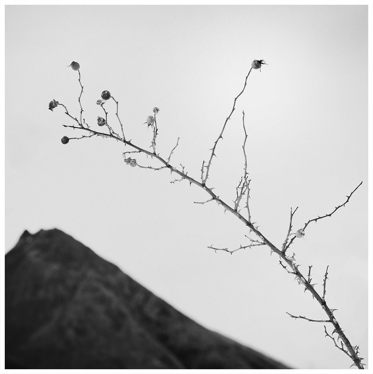
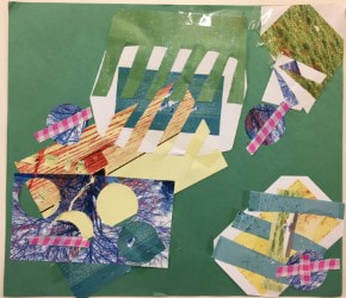
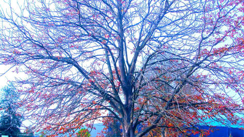
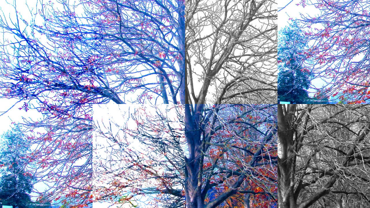
Abstractions\personal project
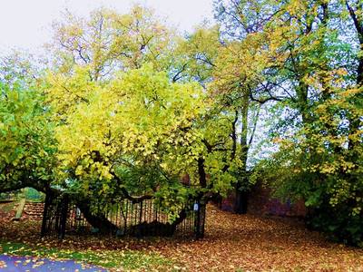
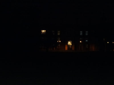
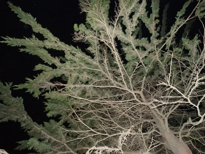
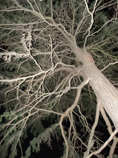
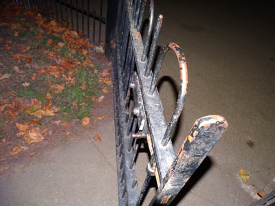
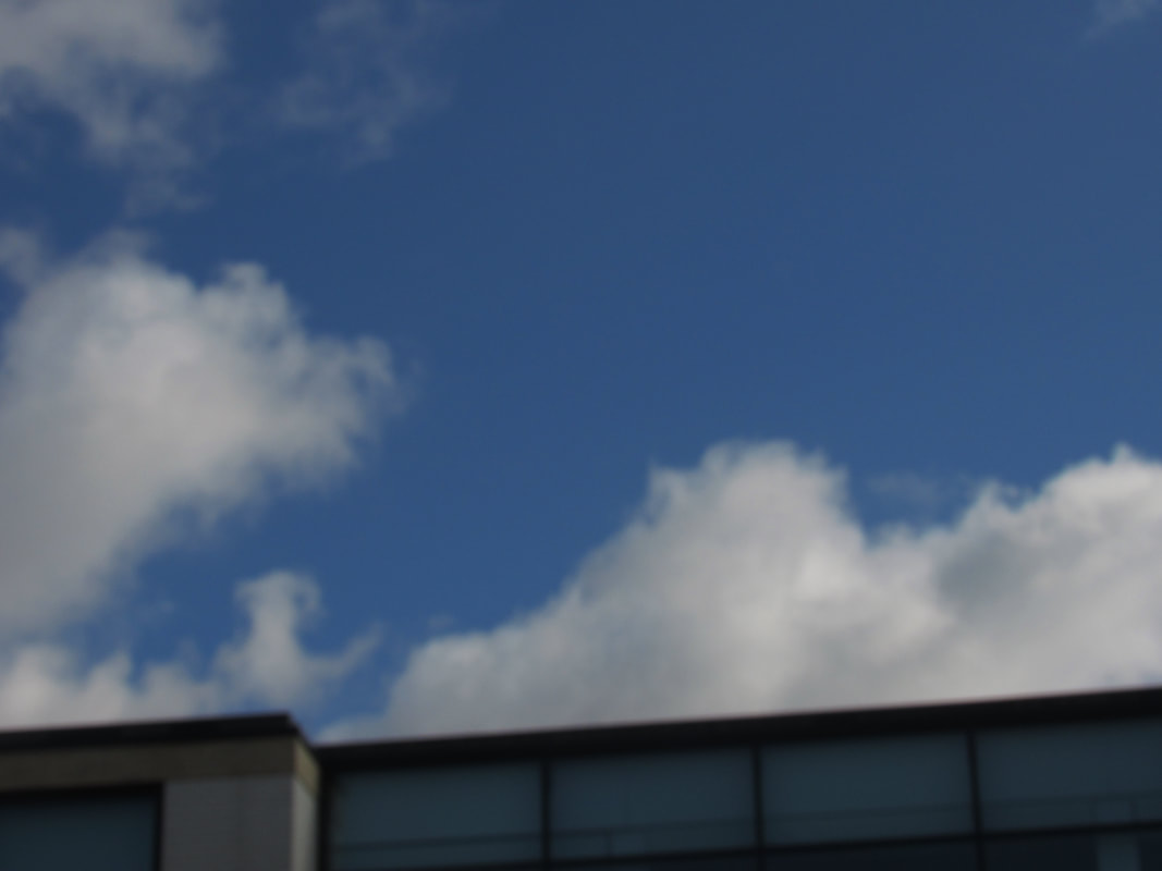
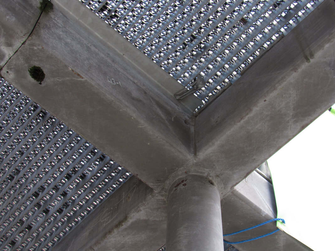
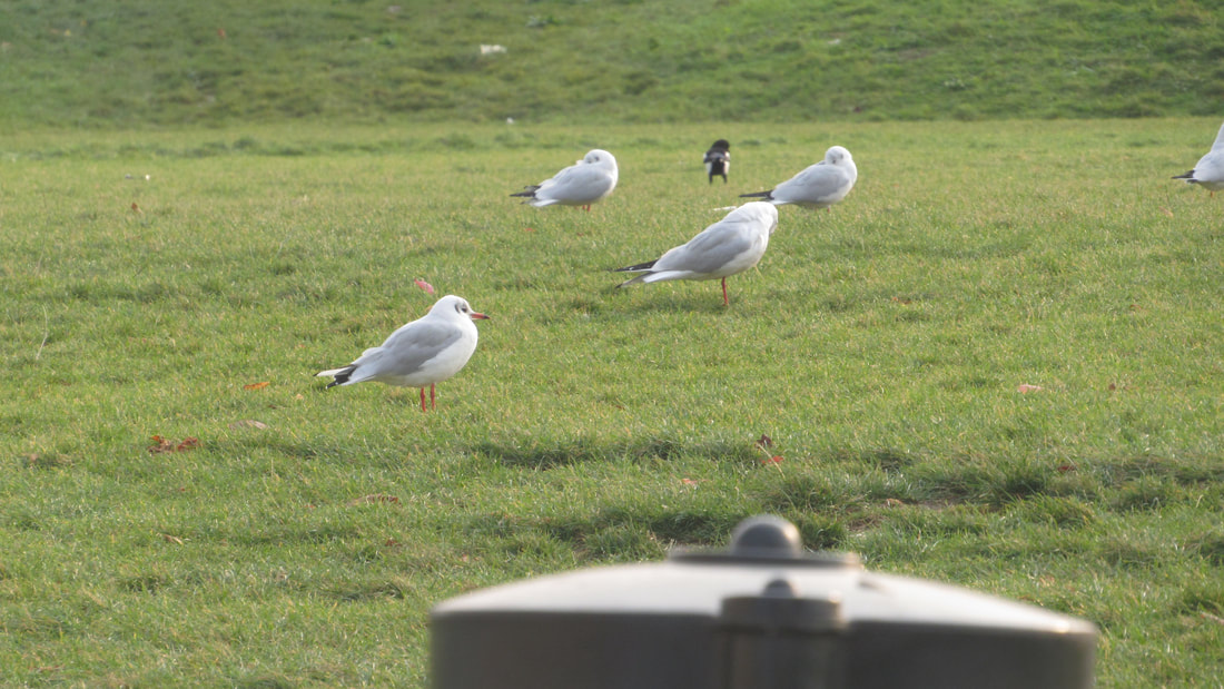
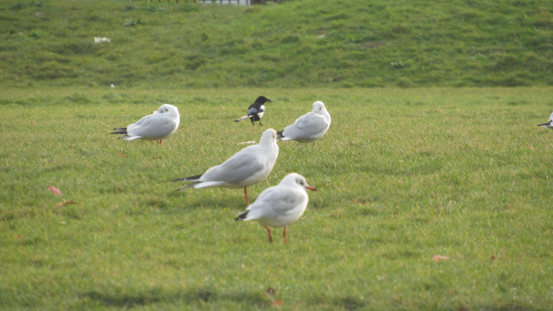
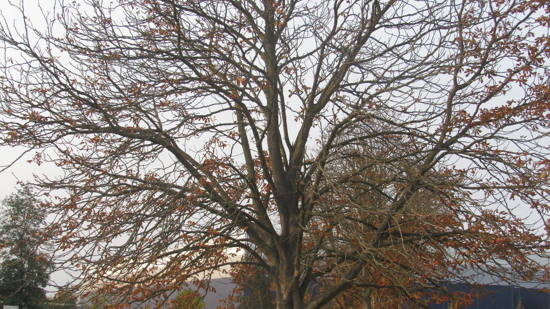
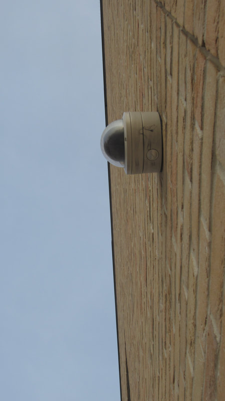
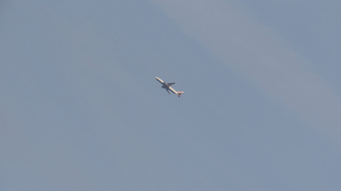
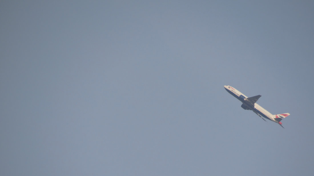
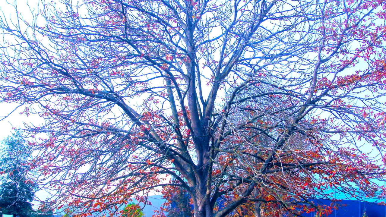
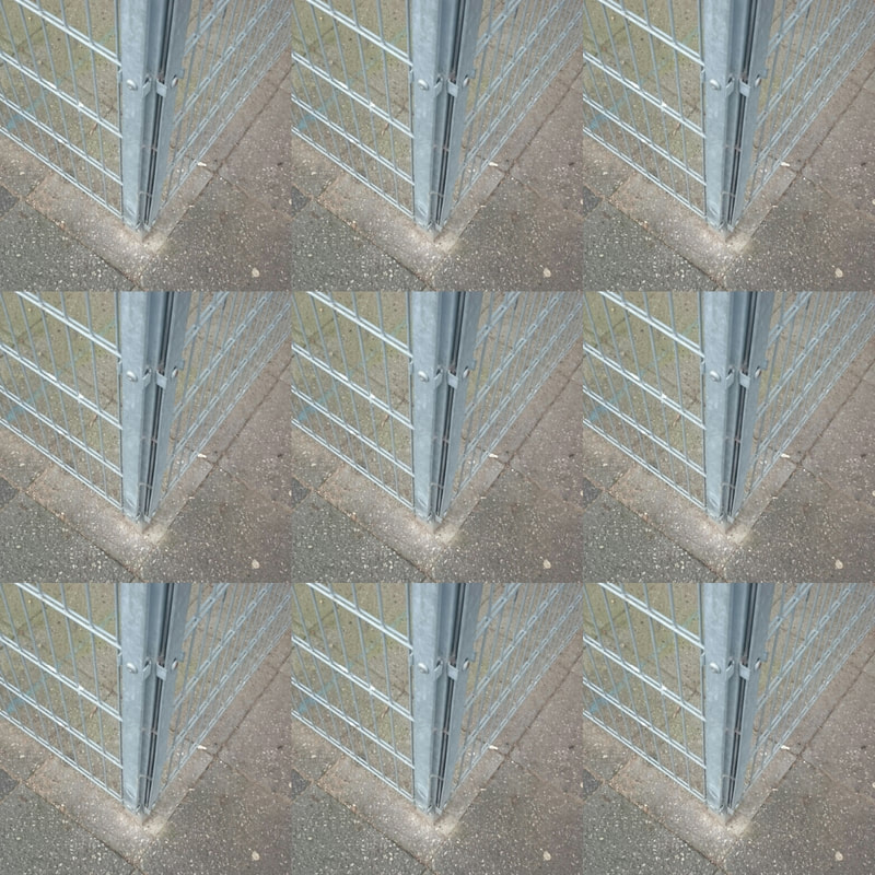
These photographs were taken in school from different angles locations of the playground and buildings.there fore there is a change in lighting.this makes it more interesting because it is harder to see what the object or thing is.


Focus:Which areas appear clearest or sharpest in the photograph? Which do not?
light:Which areas of the photograph are brightest? Are there any shadows? Does the photograph allow you to guess the time of day? Is the light natural or artificial? Harsh or soft? Reflected or direct?
line: Are there objects in the photograph that act as lines? Are they straight, curvy, thin, thick? Do the lines create direction in the photograph? Do they outline? Do the lines show movement or energy?
repetition: Are there any objects, shapes or lines which repeat and create a pattern?
shape: Do you see geometric (straight edged) or organic (curvy) shapes? Which are they?
space: Is there depth to the photograph or does it seem shallow? What creates this appearance? Are there important negative (empty) spaces in addition to positive (solid) spaces? Is there depth created by spatial illusions i.e. perspective?
texture: If you could touch the surface of the photograph how would it feel? How do the objects in the picture look like they would feel?
value\tone: Is there a range of tones from dark to light? Where is the darkest value? Where is the lightest?
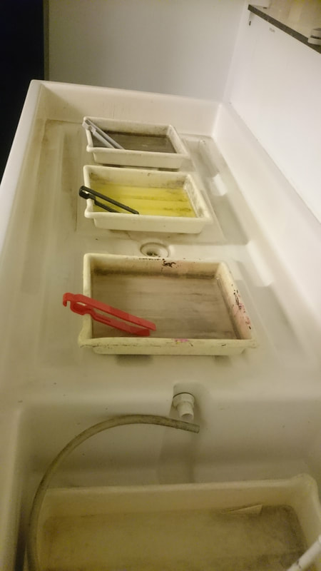
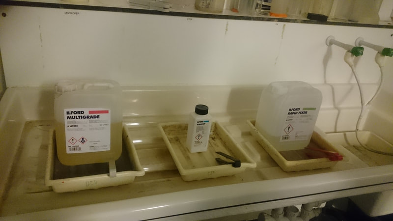
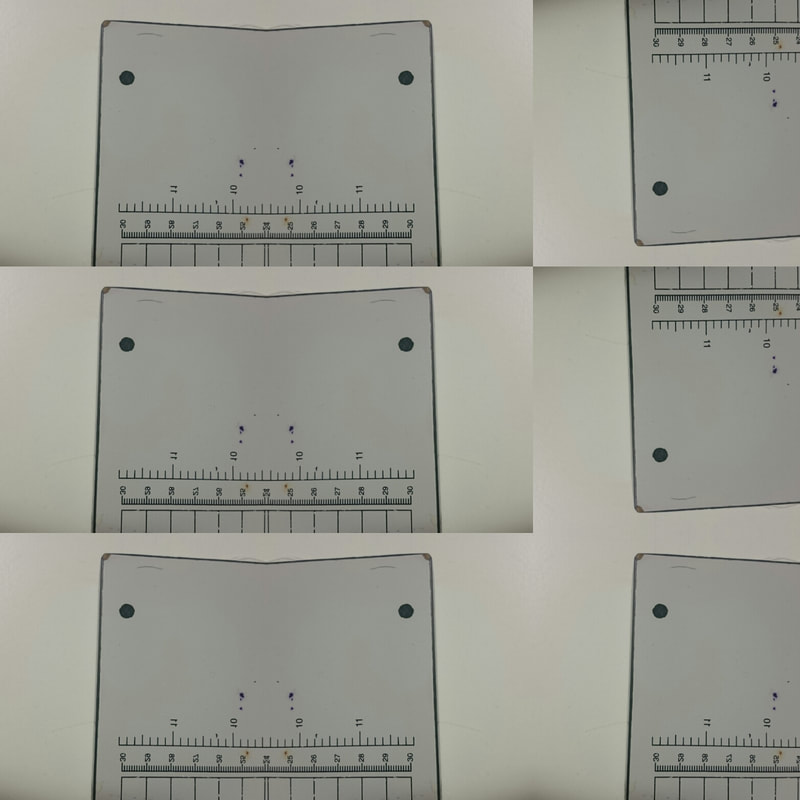
The poccess of mixing the darkroom chemicals.Developer, Stop, and Fix


- Here are some of the images showing the process before and after i have edited them, they are each edited to different colours or used a different soft ware to help me for example photo shop, photo editor and adobe light room to help me.

Harry Callahan and Jackie Ranken
Harry Callahan was an American photographer who experimented in many fields from abstractions to people who wasn't fully dressed and even botanical studies. He taught photography at the Chicago Institute of Design in 1946 and, in 1949, took over as head of the college’s Department of Photography.
In abstract terms, he created simple landscapes from regular points of view, all while including human elements. He also did what I personally call “micro landscape photography” with his weed studies. In these, he depicted small weed bushes growing in the snow as isolated forests, which is something similar to the real forests captured by Michael Kenna
here are a few photographs that the took in his career.
Jackie Ranken learned her craft by working as a darkroom technician, and was a freelance and sports photographer, a wedding photographer, a commercial photographer and a photojournalist she has many other interests although she dedicated most of her time to the projects in photography.
Focusing on two of my favourite projects, the first is called "Aerial Abstracts." In this project, Ranken has taken aerial landscapes of Australia with a single piece of gear which was seen in a medium format camera generously loaded with plenty of 120 black and white film. The other project is a beautiful narrative crafted with conceptual and abstract works done only in Antarctica. she used to pick them out herself.
Truly a great and remarkable piece of eye candy that hints at the abstract and lands on surrealism is Ranken’s "Other Realities" project, which has well known elements of landscape photography.
here are some exsamples of her art

|
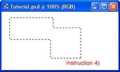
1)
3)
4)

|
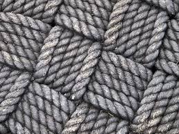
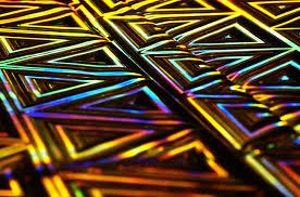
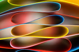
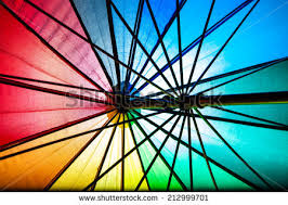
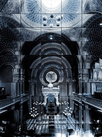
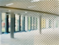
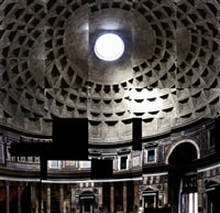
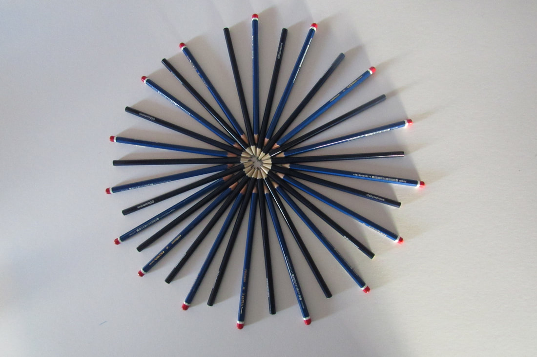
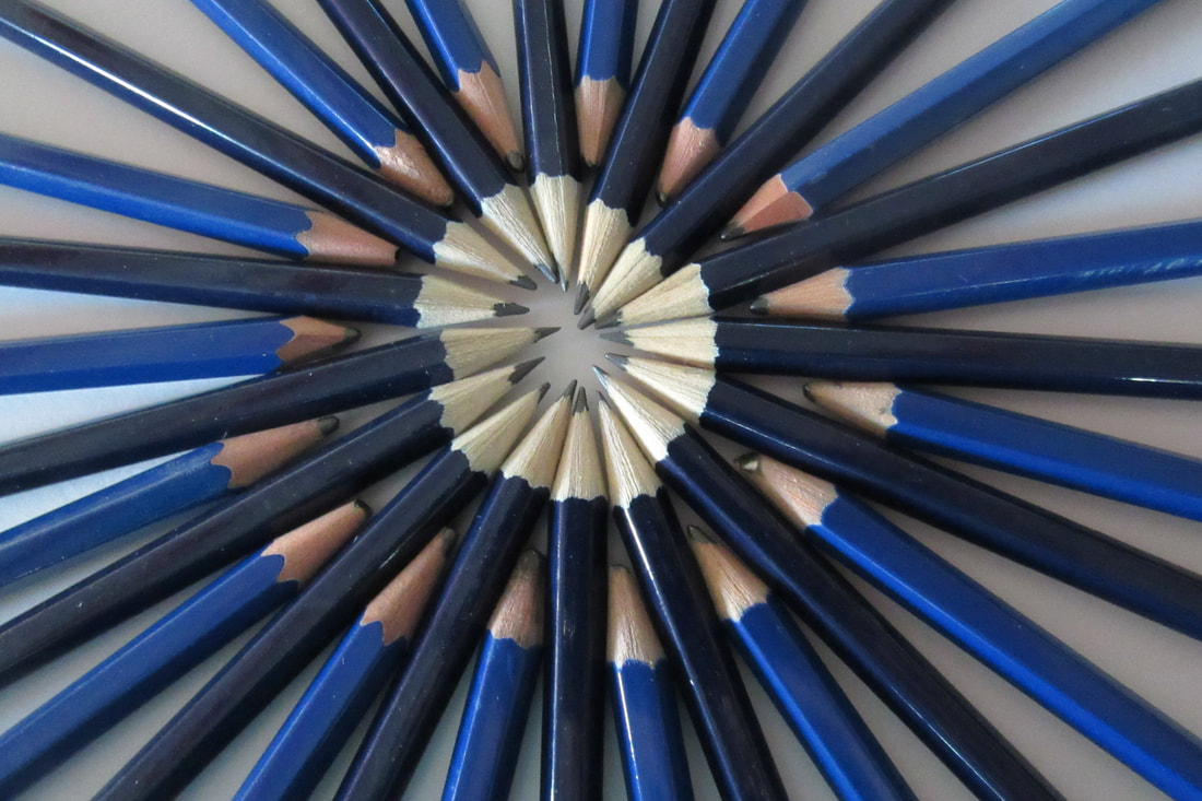
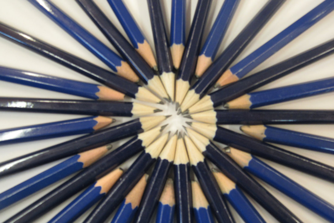
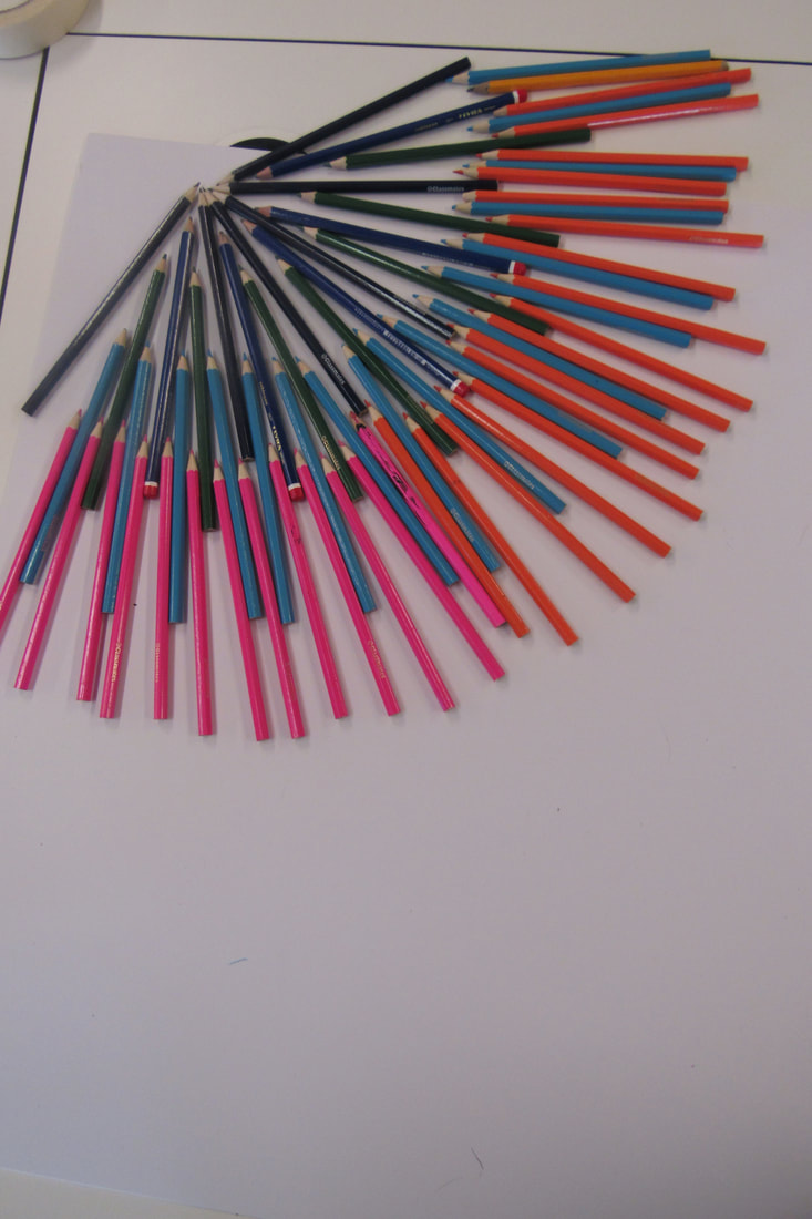
Ola Kolehmainen abstract pattern photography.


10 hour assessment prep.
My first idea of my final piece is based on the artist that I am inspired by, her name is Ola Kolehmainen and I find her work inspiring because it seems abstract and her work is full of repeated patterns. I am planning on making a piece of art that is based on the theme of abstraction and I would like to use multiple techniques and softwares to help me such as mirroring and rotating, photoshop and layout. I am aiming to create a book of my research end information that I have found out throughout this project.
Ola Kolehmainen
Recently Kolehmainen has shifted away from his normal themes of minimalism, and expanded into a more complex approach dealing with space, light, and colour in his first exhibition centred around historical architecture. In addition to their historical dimension, kolehmainen probes the buildings’ architectural volumes and light ratios: the buildings’ interesting interiors and structural details reveal the changing light of days and seasons. The photographs textured ornamentation reflects historical layers and decorative interiors. Space and light are powerful and key in Kolehmainen’s images and help to successfully capture the sublime essence of these historic buildings, which radiate the mosques’ mystical quality.
Kolehmainen graduated from the University of Art and Design Helsinki in 1999. The Berlin-based artist is one of the leading figures in Finnish photography. His work is included in multiple international art institutions, foundations, and collections, from Germany and Spain to renowned Nordic museums such as the Malmo Art Museum and the Museum of Contemporary Art Kiasma.
Kolehmainen is an abstract photographer and artist who has taken on lots of different professional process and methods in creating an amazing and successful piece of art. Alot of Kolehmainen work is theme related or has alot of planning and structure for example which direction do you want the light to shining from and weather there are going to be any shadows in this image, there are so many decisions to make to make your photograph look amazing.
Andrew S. Gray
From intricate and nearly impossible points of view to elegant camera shakes, abstract can be done in a variety of ways from simple to complex, all of which produce elegant results. Inpsired by the paintings of the old English masters of pictorialism, Andrew S. Gray creates beautiful abstract landscapes with a unique style using intentional camera movement as well as well-planned color palettes.
He personally prints his work, which speaks volumes about his workflow mastery. In fact, Gray is so generous that he even helps people around the globe with one-on-one sessions and video tutorials in addition to offering online help for anyone trying to create landscapes (or other imagery) with a similar style of abstraction.
"The looseness and ability to play without being tied by the light or weather affecting the scene you’d normally be shooting is the style’s appeal to me, also the chance of creating a scene that was not necessarily there. Using a tool of which its sole function is to capture exactly what is in front of it and then making it almost become a brush with which we “paint” is a joy. The results I have achieved since first experimenting with intentional camera movement (icm) have been more satisfying than any photograph I’ve made previously~".
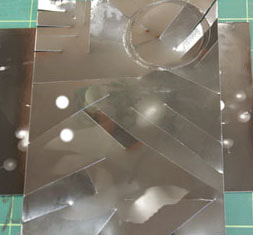
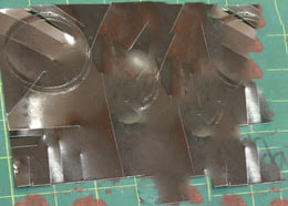
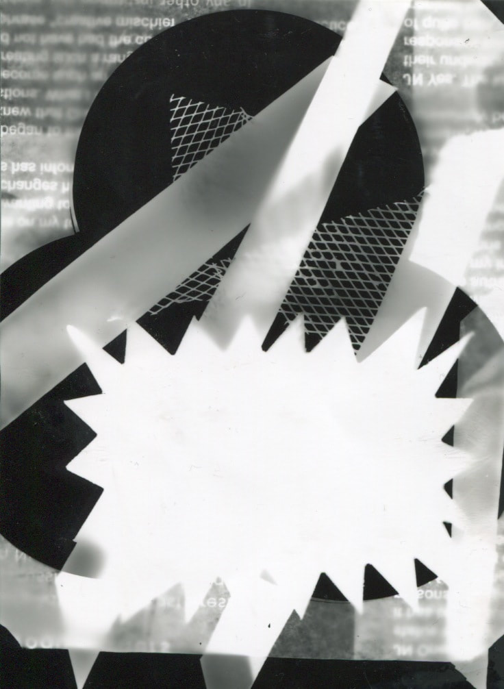
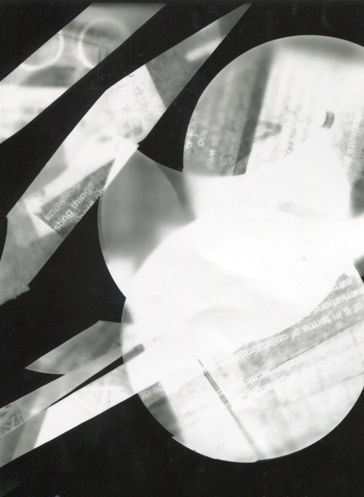
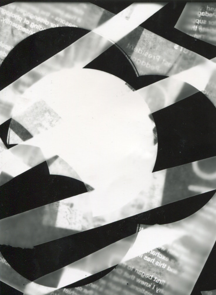
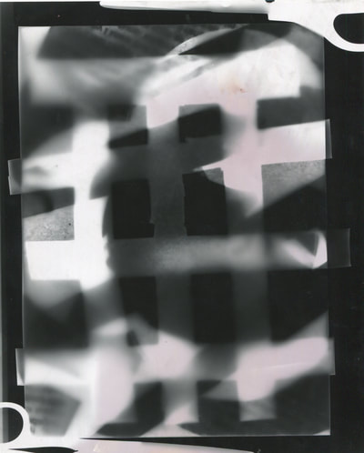
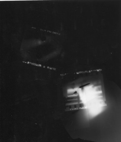
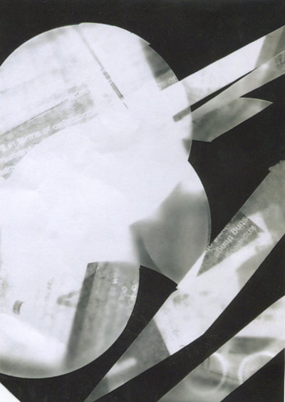
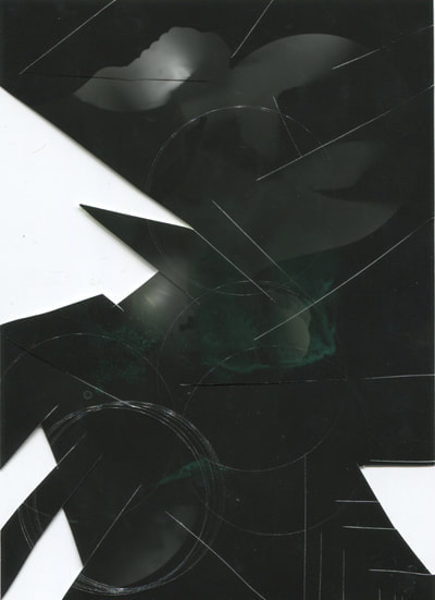
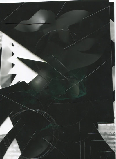
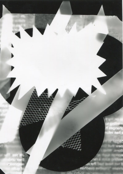
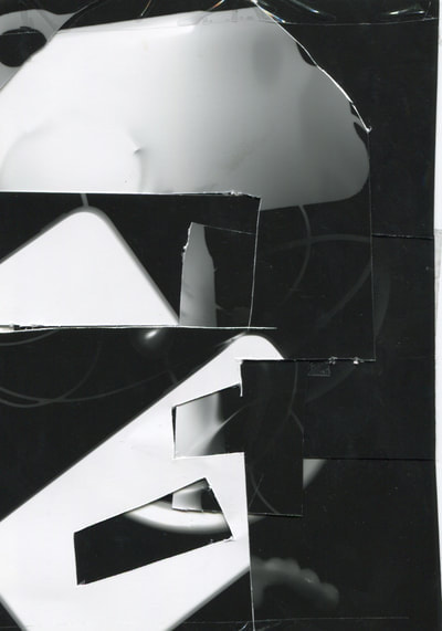
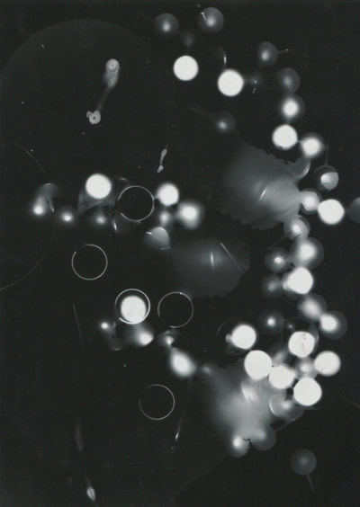
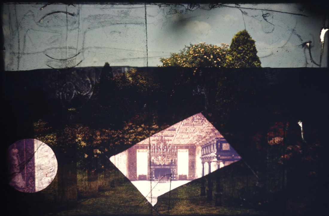
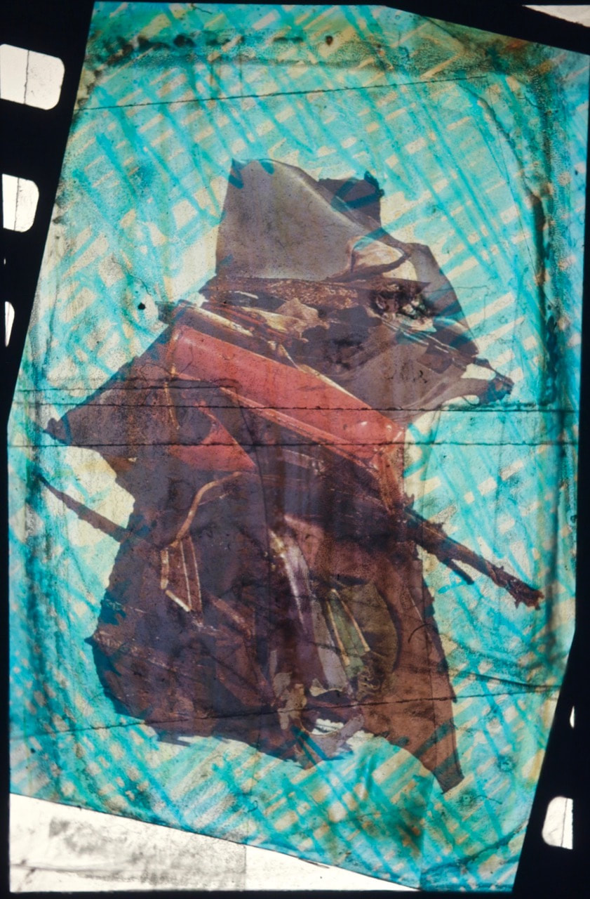
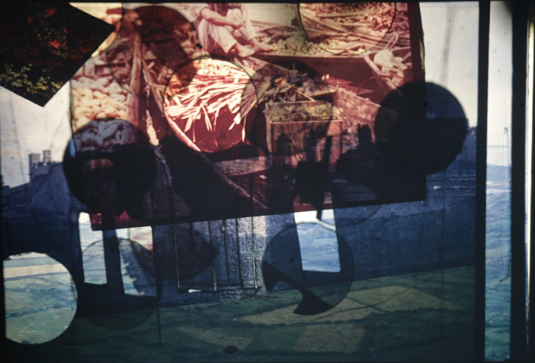
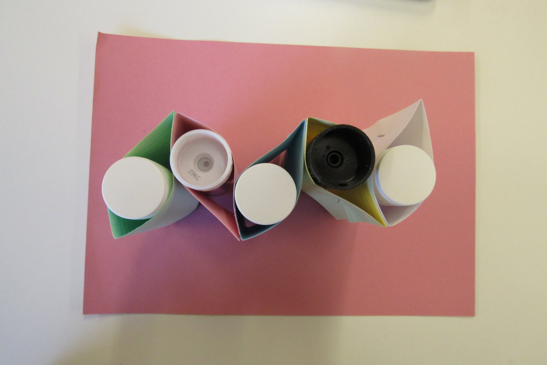
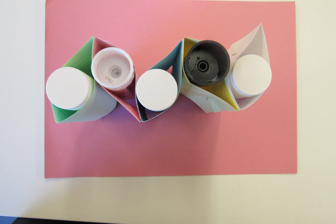
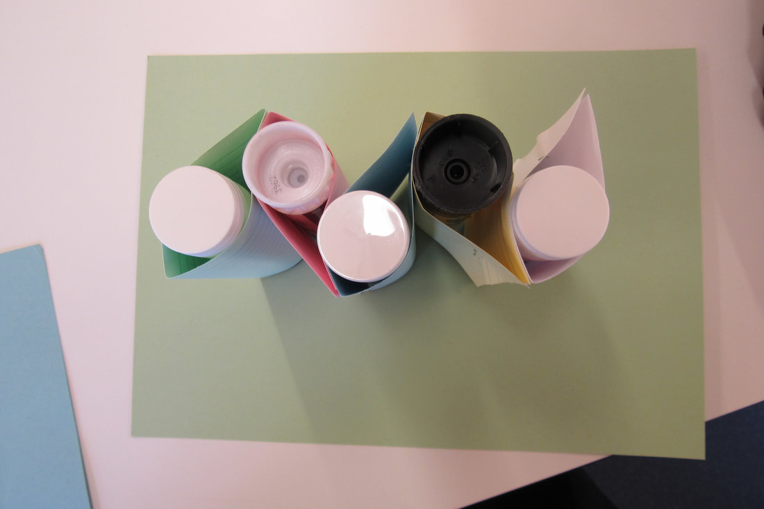
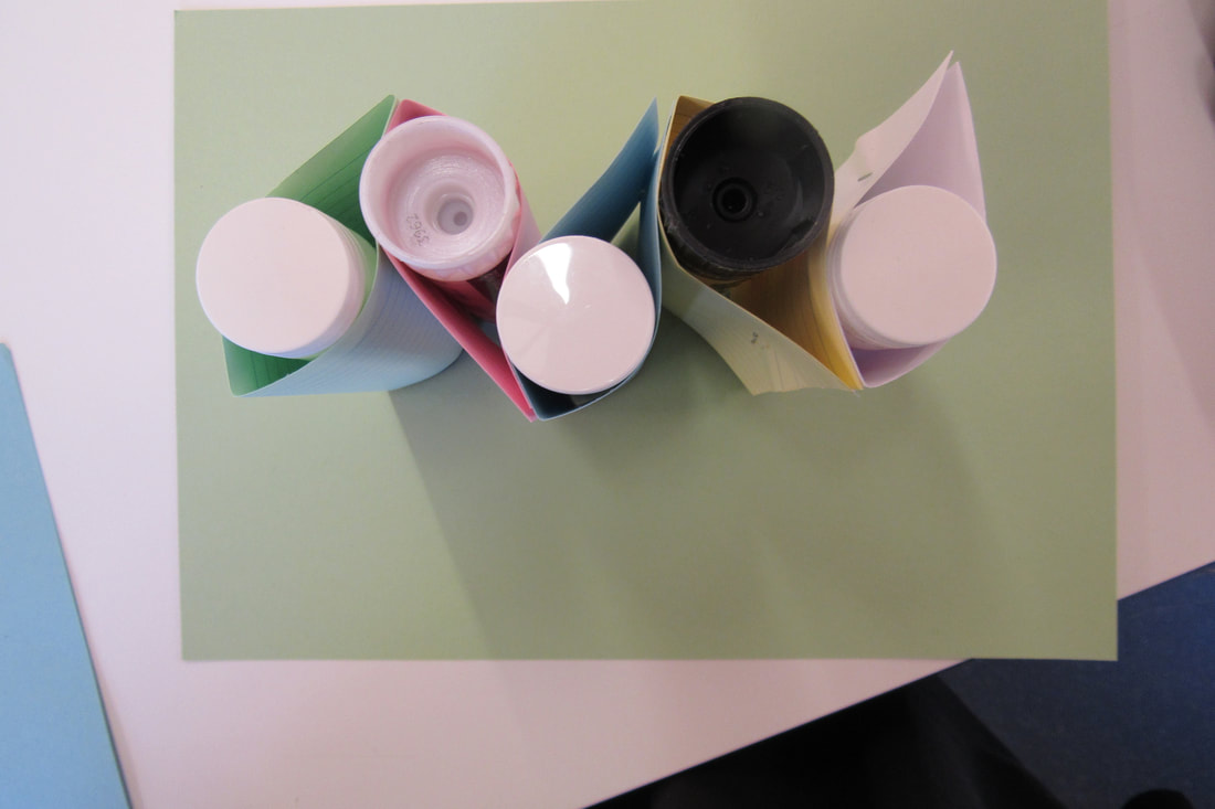
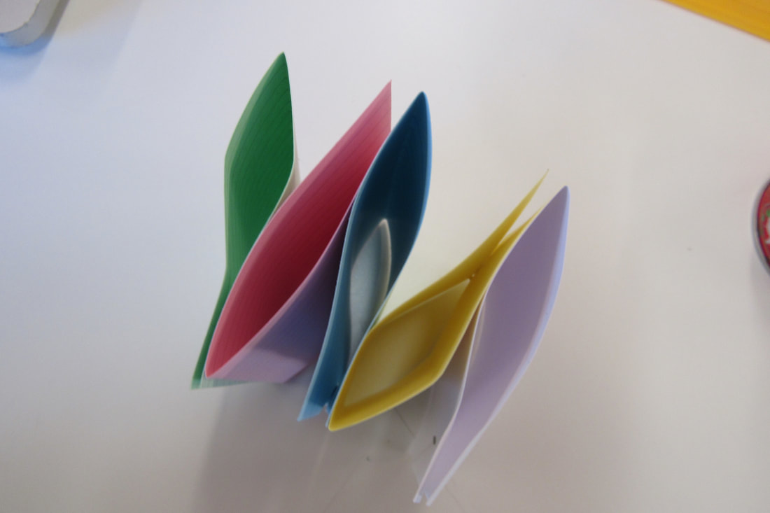
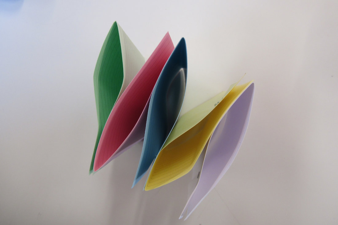
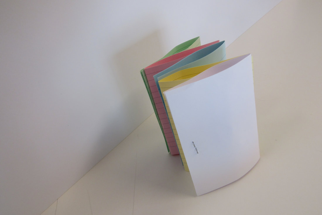
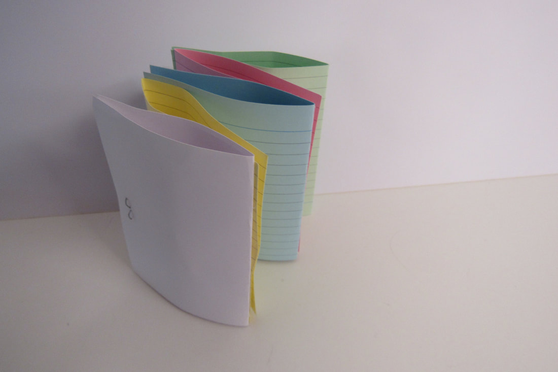
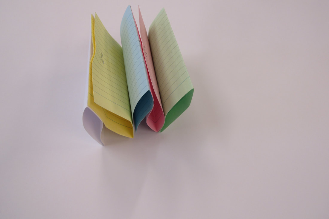
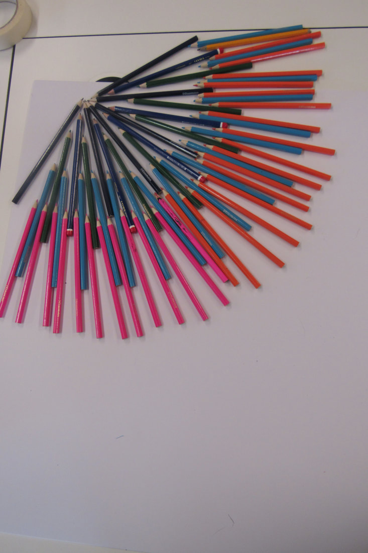
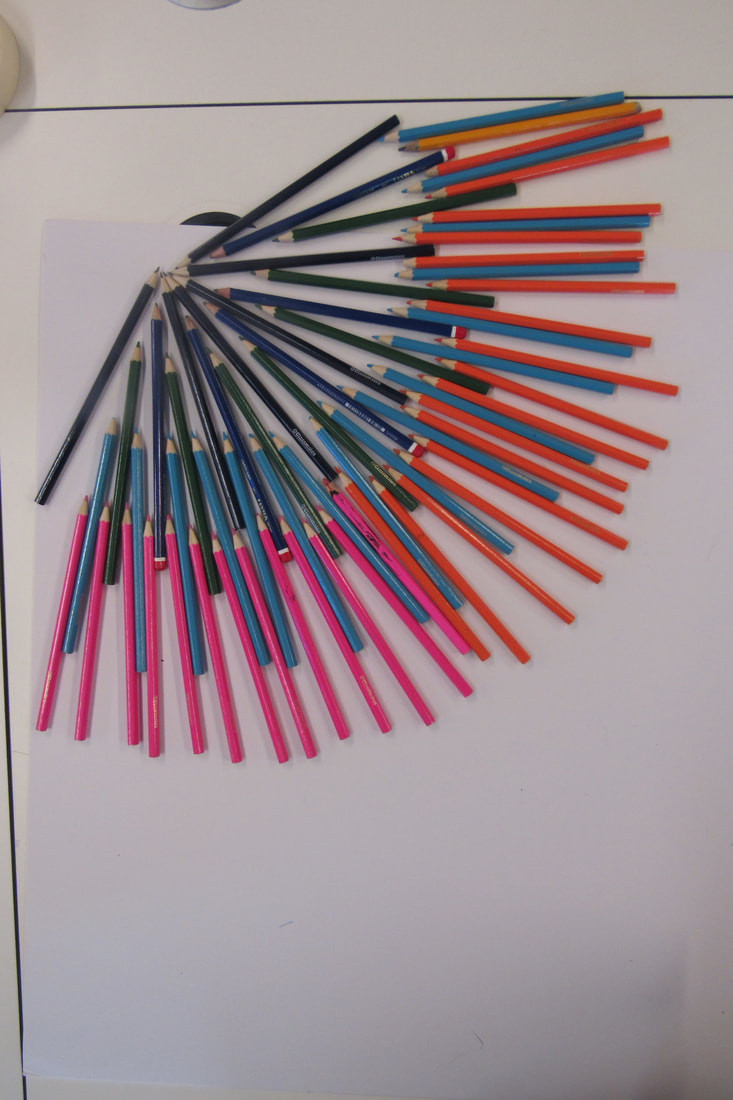
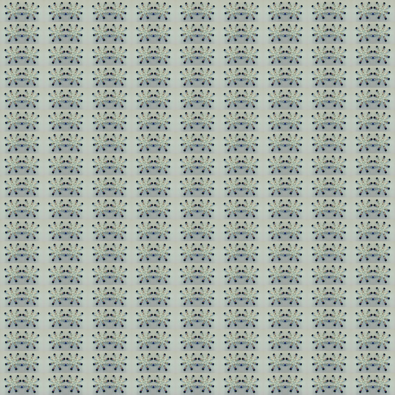
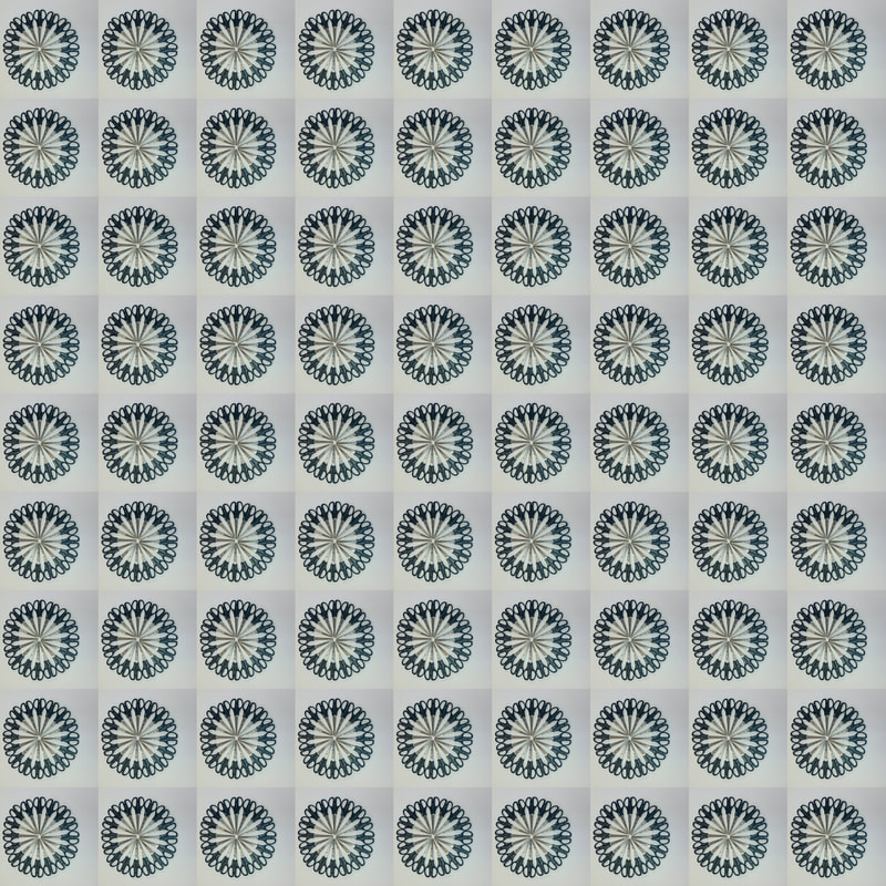
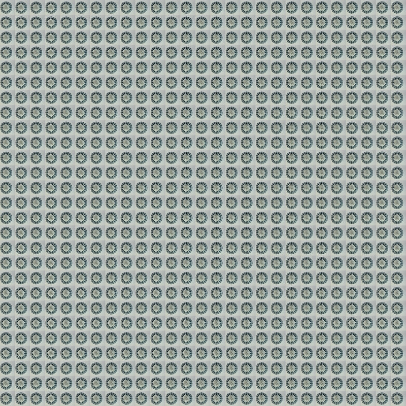
Dafna Talmor_*visit
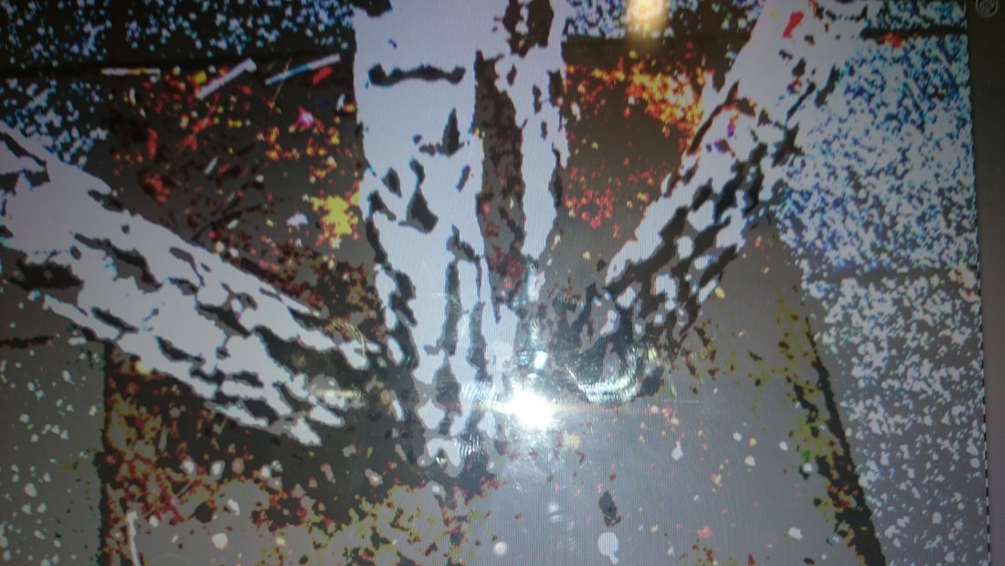
Here are the negatives I have created inspired by Dafna Talmor's work.
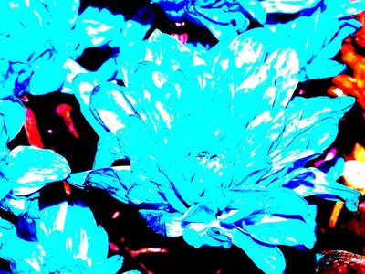
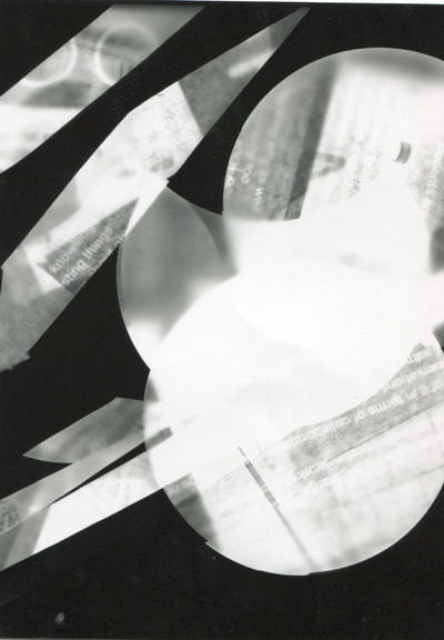
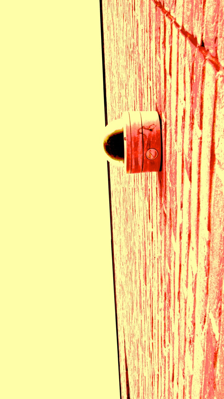
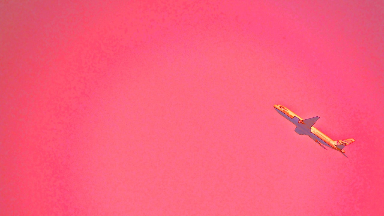
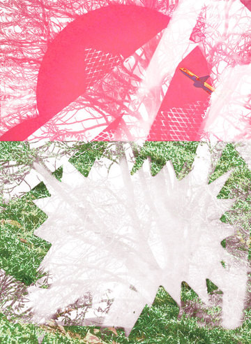
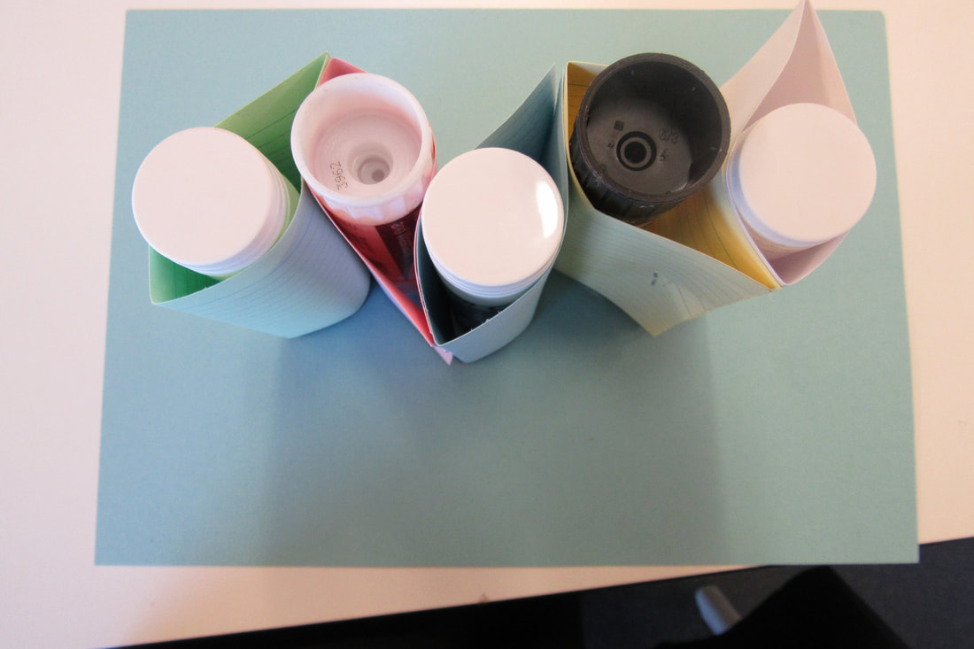
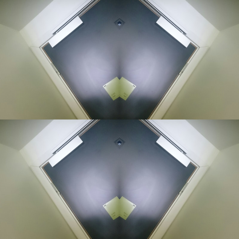
Abstraction_*
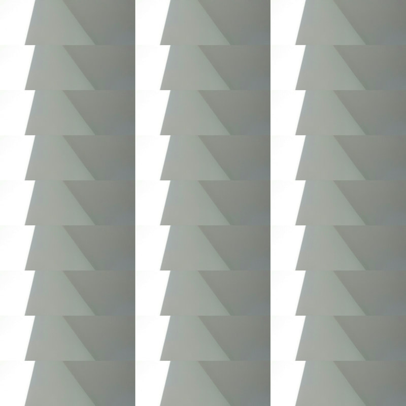
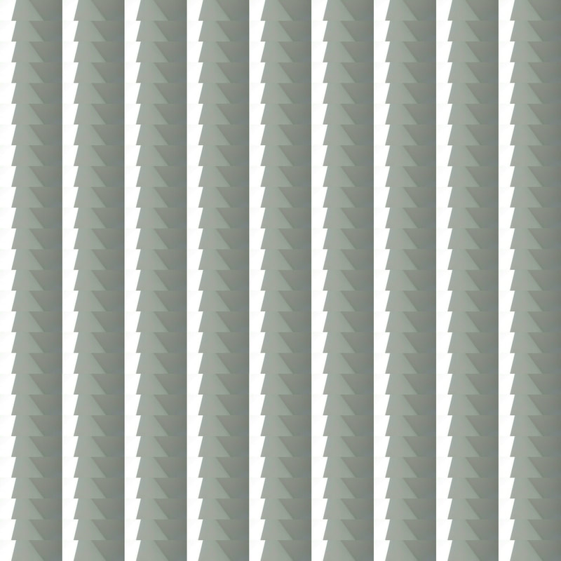
these images were my first out come of the abstraction work that was inspired by my chosen abstract artist/photographer in which I have made and created patterns that I have similarly tried to equiparate In my work also thinking about colour and shape.
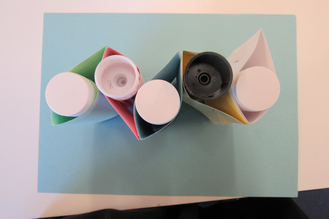

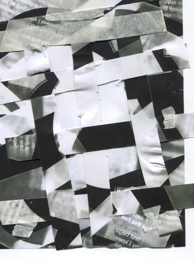
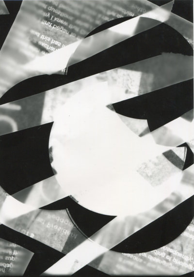
Following on from last out come I developed my ideas and created another gallery of images based on the same artist and the new research I have done.
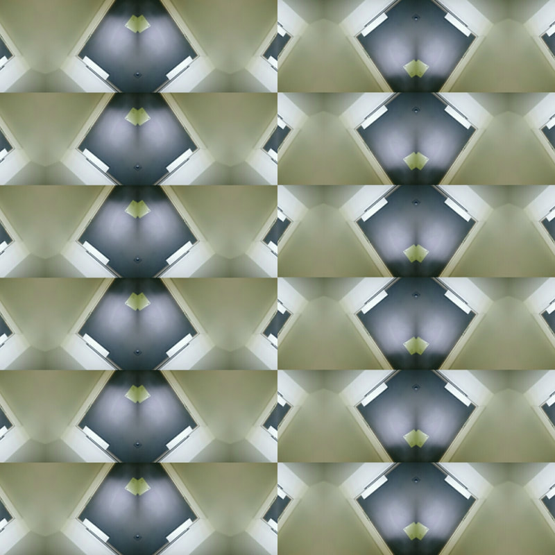
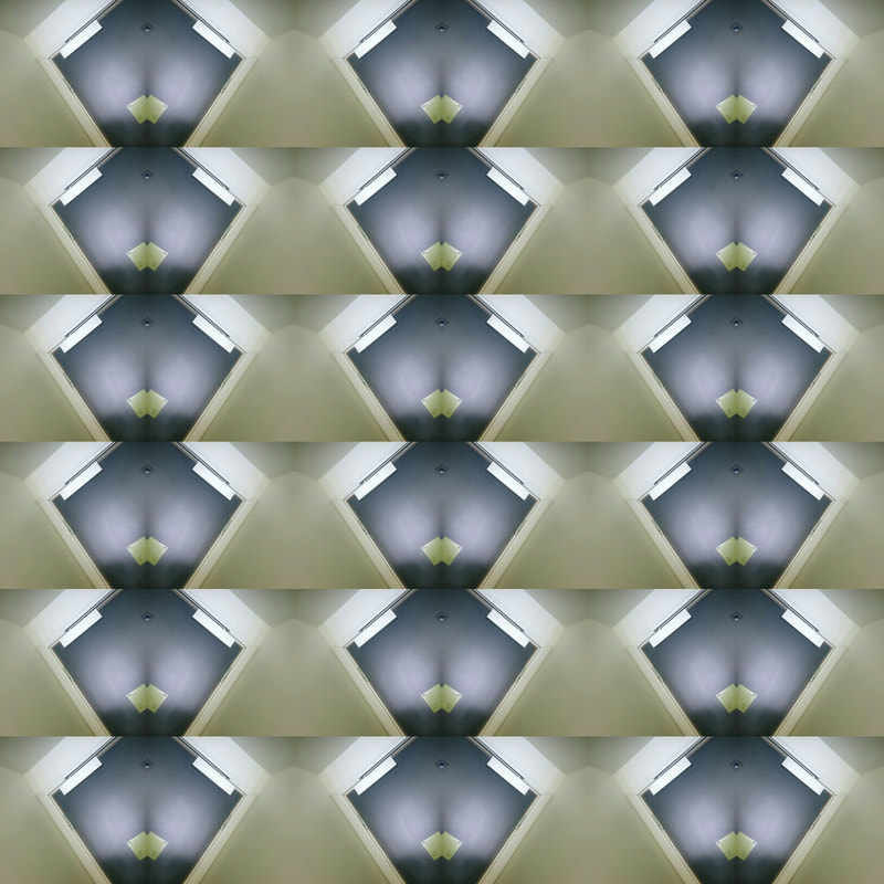

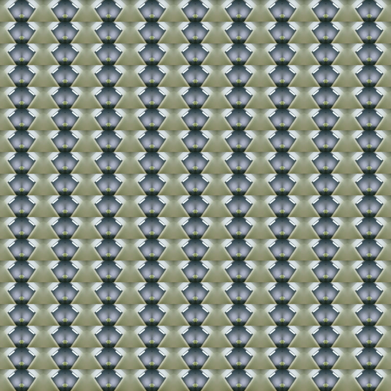
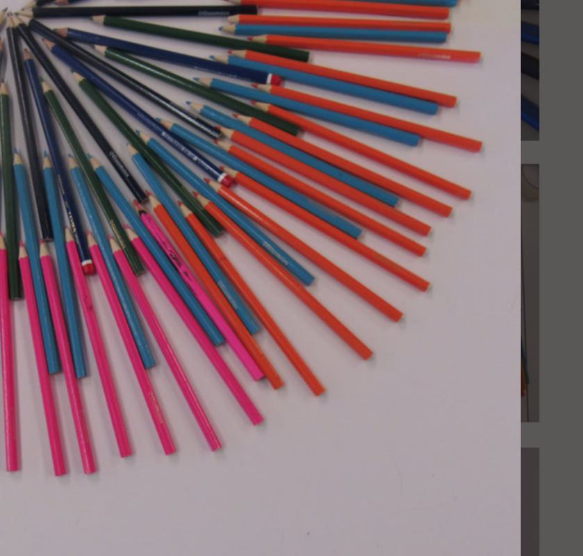
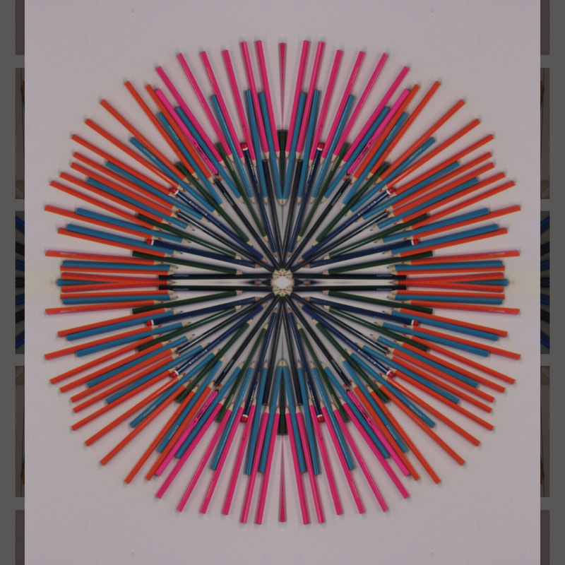

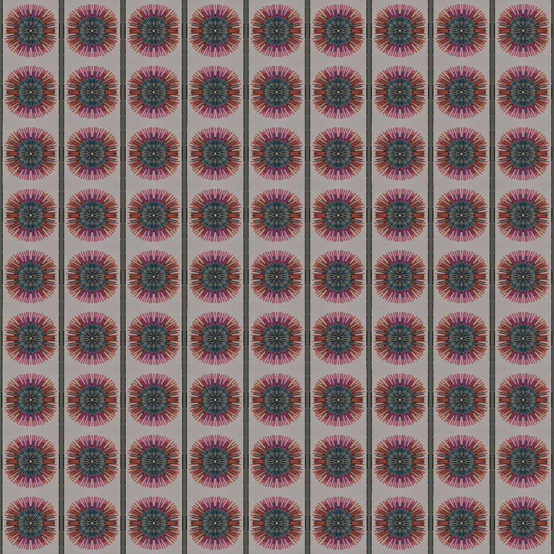
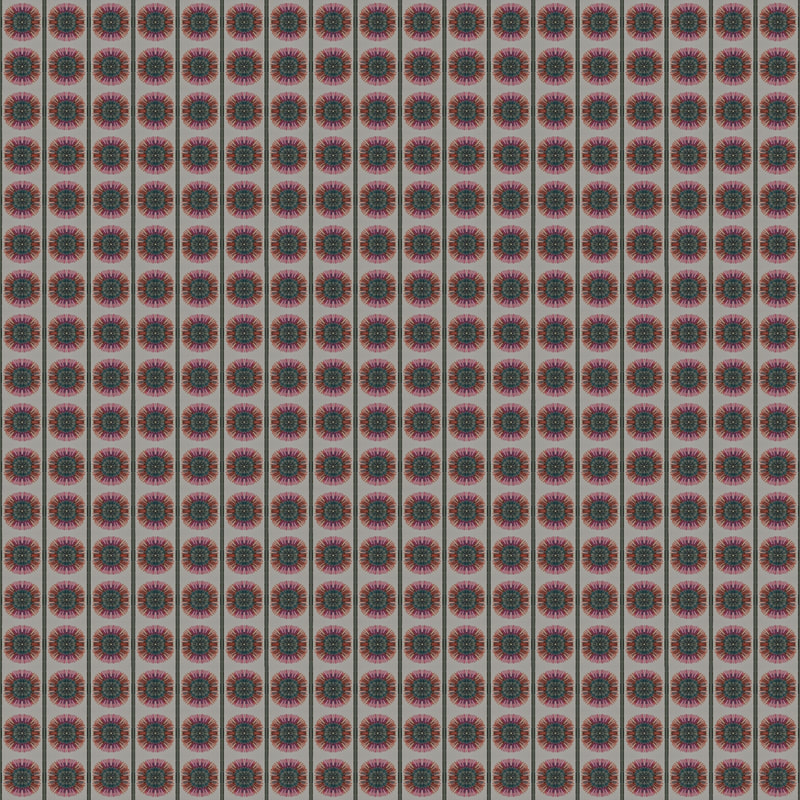
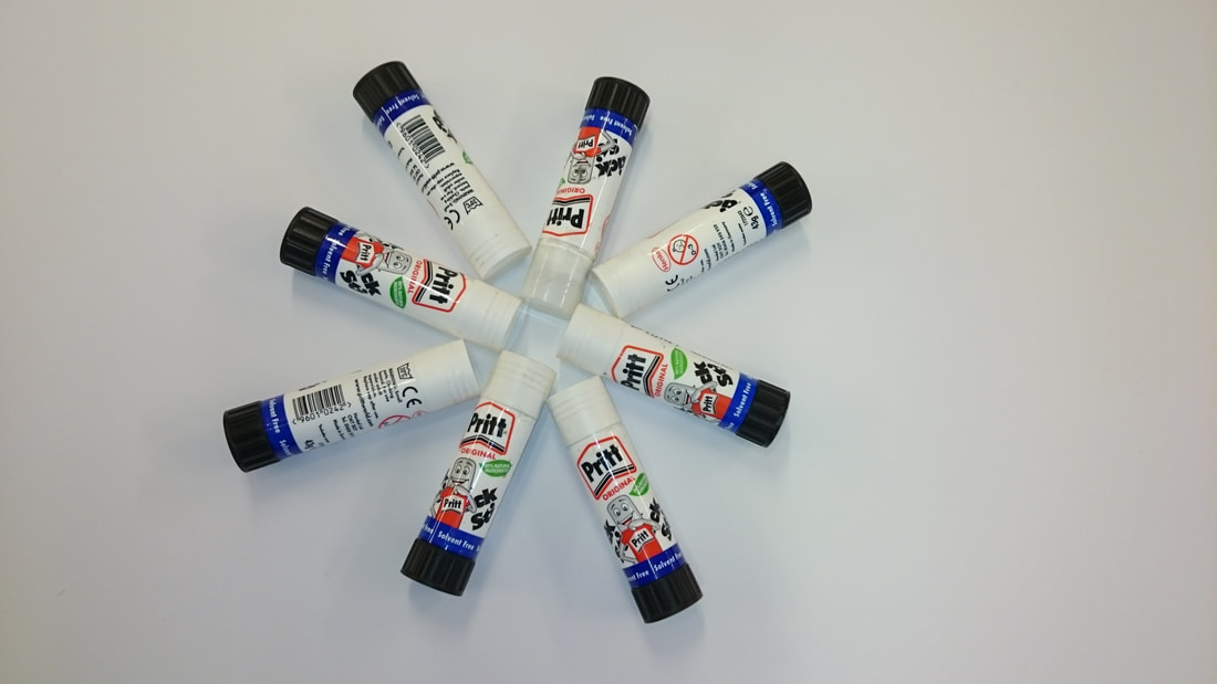
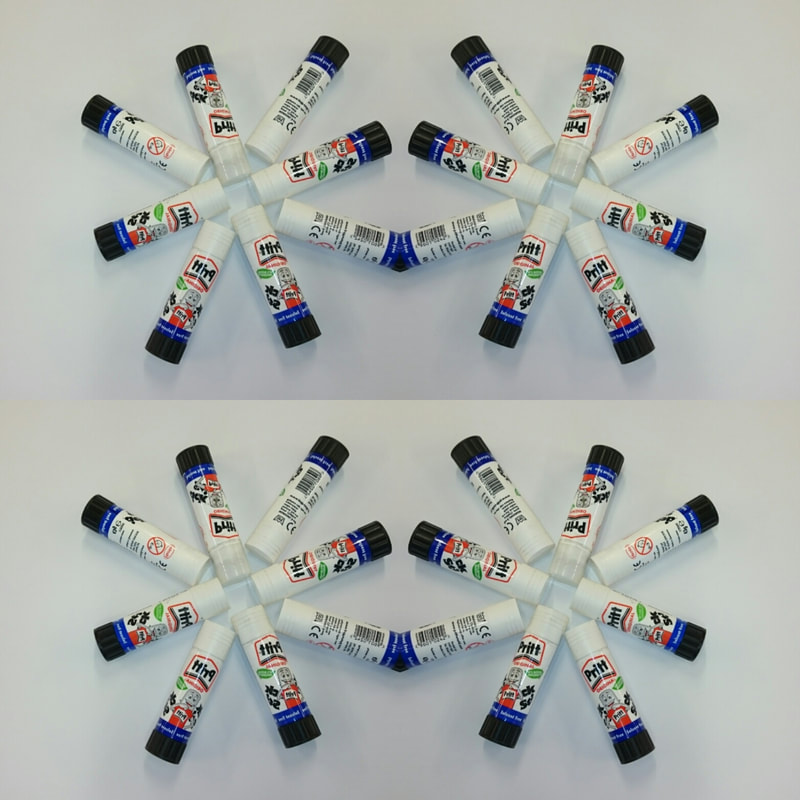
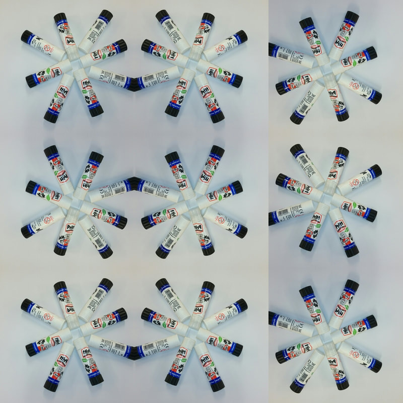

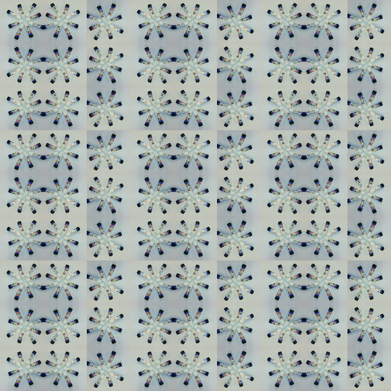

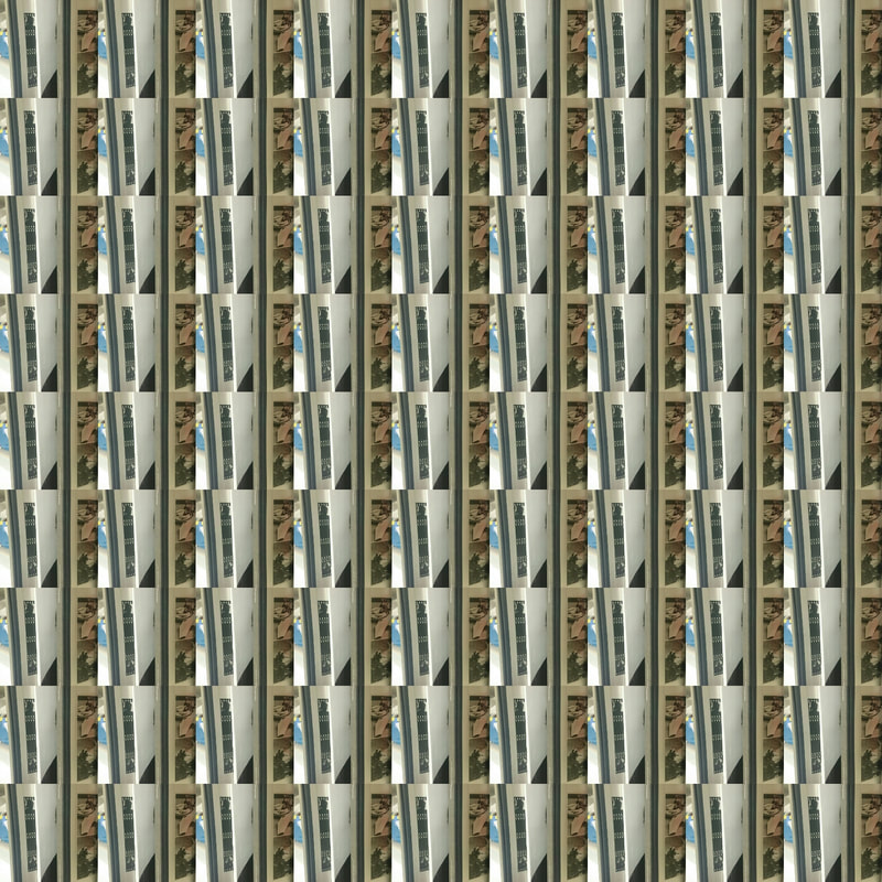
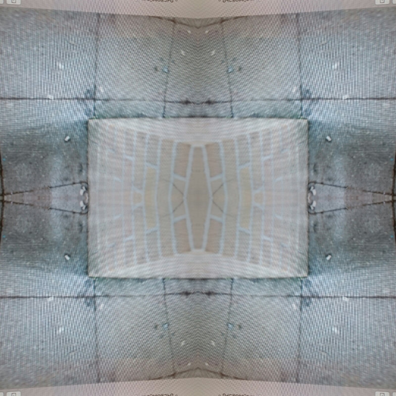
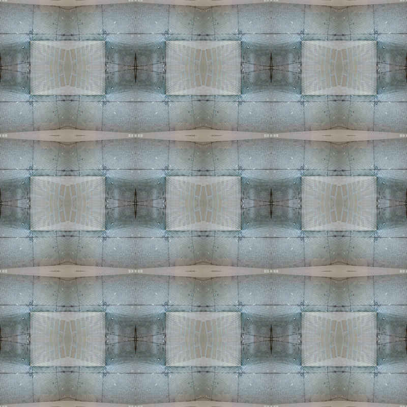


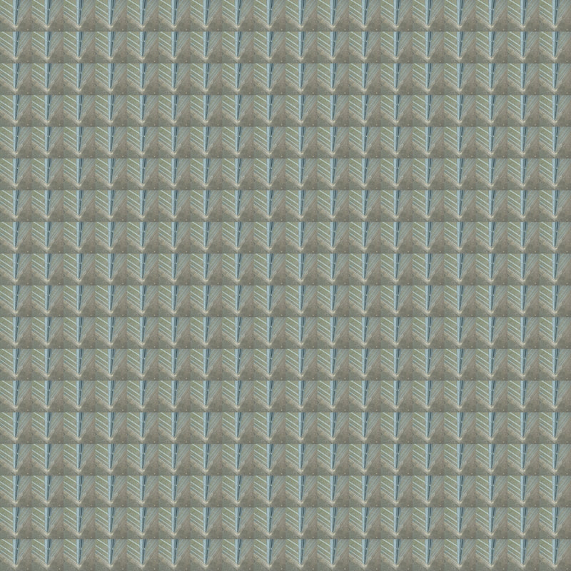
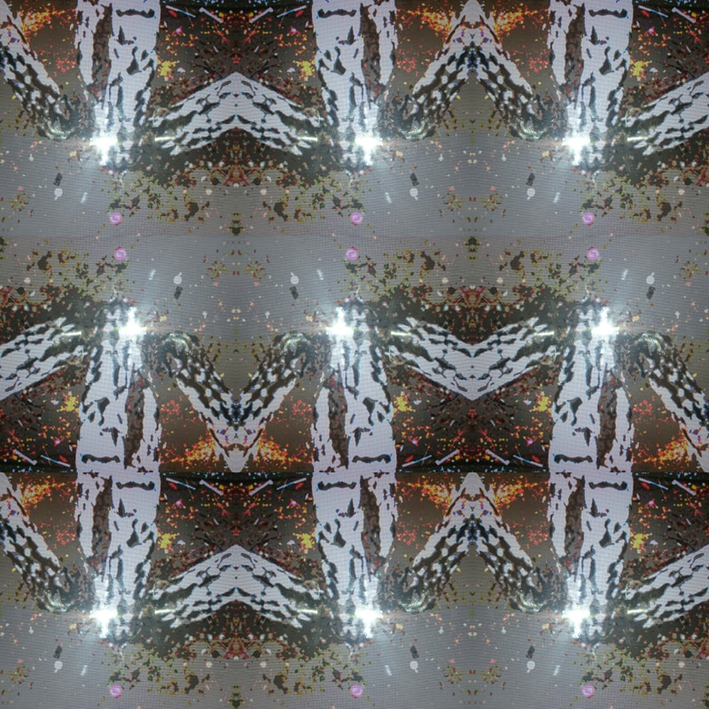
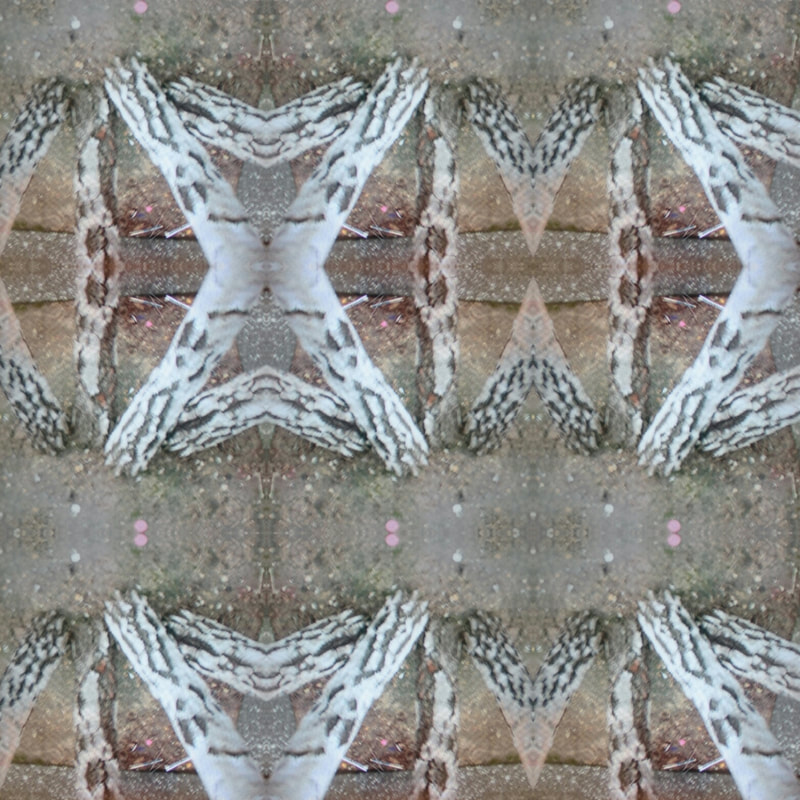
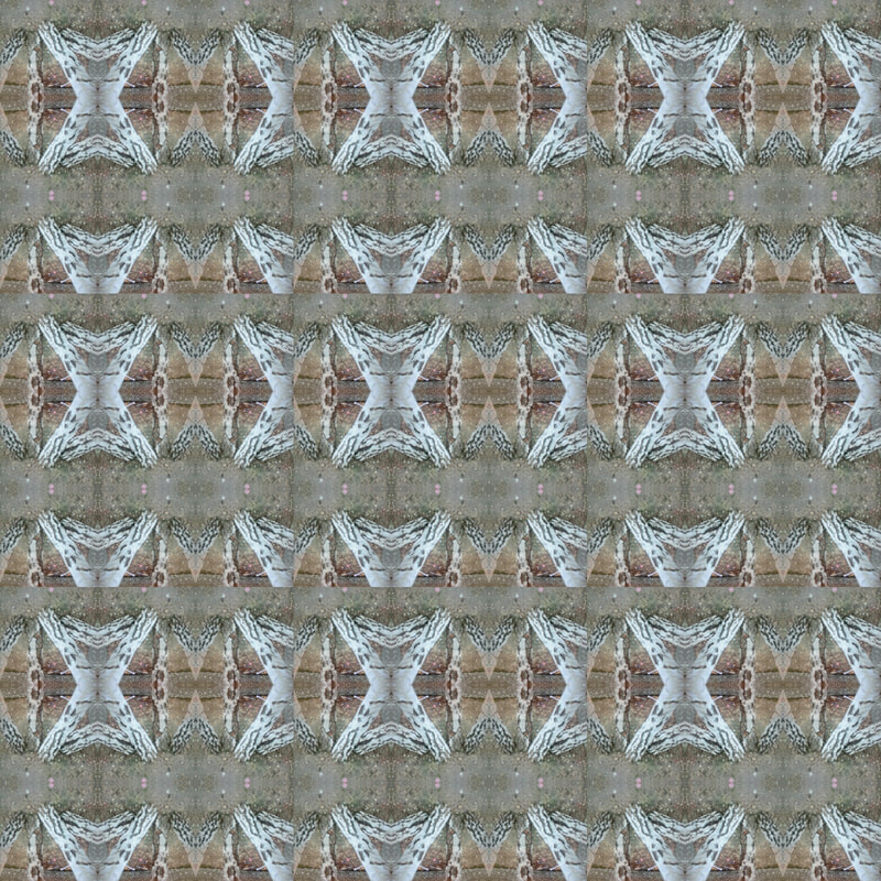
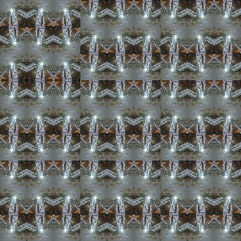
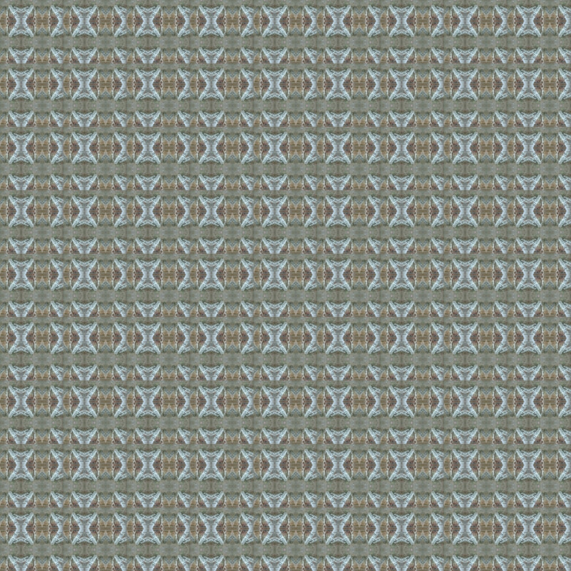
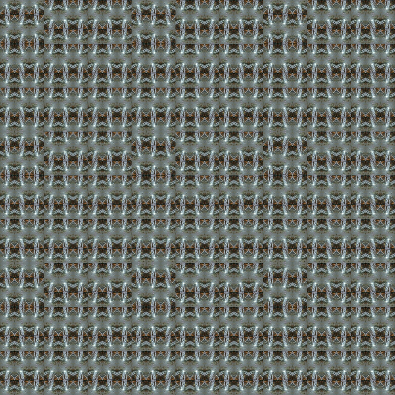
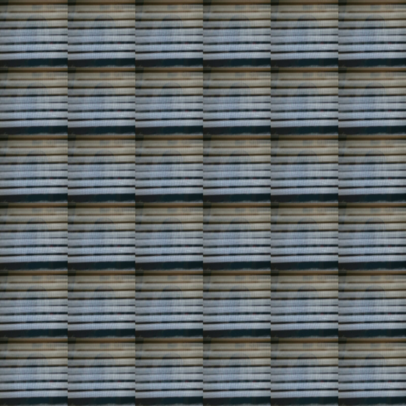
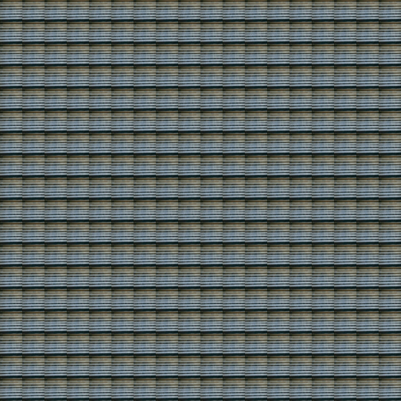
The idea i have got from Ola Kolehmainens work is repetition and pattern. I have created my images inspired by her abstract work and i have tried to change the effect of the pattern.instead of creating one image and sectioning it into a grid, I have tried to differentiate my images and depilate them into more than one by mirroring and flipping them to create a further abstraction.
In Ola's work you will notice that her work has a natural constrast in colour and i have change the colour rather than the colour being natural.
In Ola's work you will notice that her work has a natural constrast in colour and i have change the colour rather than the colour being natural.
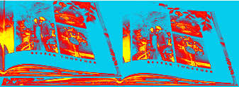
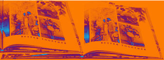
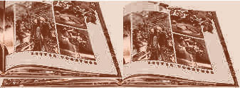
Abstraction final piece_final out come.
|
At the beginning of my abstraction themed project, I took a series of images following the theme of abstraction and was inspiration from other artists and to develop and refine my ideas to the best of my ability. In doing so I thought about the tone, shadows, angles and were the main object is going to be placed and if you are going to crop part of the image. In the main image that I have worked on in my final outcome I have been editing my images by playing with contrast, brightness and sharpness. I have been doing this to make it slightly more exaggerated and to make the main object stand out. when taking a series of photographs you always have to think about things like angles, if so where is the light shining into the image and what direction you are facing when you are taking the image. Along with thinking about shadows and if you can inculpated them to developed the look of your image further.
|
|
|
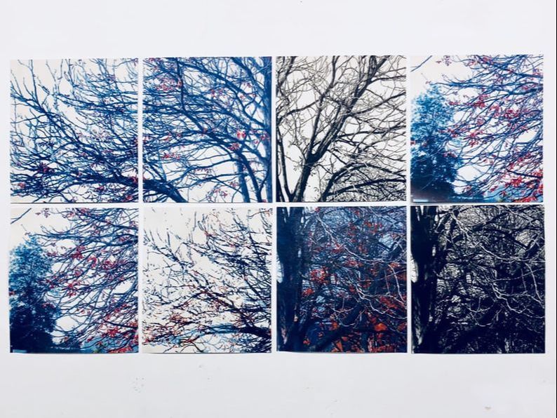
In photoshop I have created a much more developed version of my original image and have cut it up into background and foreground and have change where the sections are located sticking to the grid lines and keeping to the fact that there are eight sections to this image. In the process I have made two of the eight sections black and white to give it more of an abstract and individual look and feel.I developed and refined my original image overall so far six times to finally get to my final out come to the standard that I am happy with and that i know that i have successfully created a final out come.
|
|
In my final out come after I had edited and developed my image and got it out of photoshop after it has been cut and developed into sections separately I printed them on to A3 cartridge paper and put them in the same arrangement that i had chosen on photoshop and i mounted them on the wall so over all the image ended up being much larger than the original image.Overall my image was made up of 8, A3 pieces of paper which is larger than A4 paper. first of all when i printed the image it was A4 and now each section is bigger that A4.
|
|
